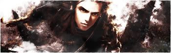
GFXVoid Graphic Design Forum

Remove Text Formatting
Loading...

» Online Users: 7,152

0 members and 7,152 guests
No Members online

» Site Navigation

 > FAQ

» Stats

Members: 35,443
Threads: 103,072
Posts: 826,684
Top Poster: cc.RadillacVIII (7,429)
Welcome to our newest member, Lekelindids
Results 1 to 6 of 6

Thread: Sigs

  1. #1
    Join Date
    Jul 2005
    Posts
    146

    Default

    Version 1: Sparks

    Version 2: No Sparks


    Tried making something different in this sigs, no wallpapers used.

  2. #2

    Default

    first ones seem a bit oversharpened and overlayed..low quality and stuff..

    2nd one is better although the fire doesnt really look good and the render is blended in quite bad on the left

  3. #3
    Join Date
    Aug 2005
    Location
    Nyköping, Sweden
    Posts
    1,908

    Default

    Originally posted by mindfields@Jan 25 2006, 06:26 PM
    first ones seem a bit oversharpened and overlayed..low quality and stuff..

    2nd one is better although the fire doesnt really look good and the render is blended in quite bad on the left
    [snapback]108508[/snapback]
    Totally agrees

  4. #4
    Join Date
    Dec 2005
    Posts
    134

    Default

    2nd one is just better

  5. #5
    Join Date
    Dec 2005
    Posts
    556

    Default

    First is better. GJ =]

  6. #6
    Join Date
    Jan 2006
    Location
    -E-Town
    Posts
    310

    Default

    i agree first is nice GJ


    I Go by Homicide On Other forums

Posting Permissions

  • You may not post new threads
  • You may not post replies
  • You may not post attachments
  • You may not edit your posts
  •  
Powered by vBadvanced CMPS v4.1.1