GFXVoid Graphic Design Forum

Remove Text Formatting
Loading...

» Online Users: 1,226

0 members and 1,226 guests
No Members online

» Site Navigation

 > FAQ

» Stats

Members: 35,443
Threads: 103,072
Posts: 826,684
Top Poster: cc.RadillacVIII (7,429)
Welcome to our newest member, Lekelindids
Results 1 to 8 of 8

Thread: C&C PLSSS

  1. #1
    Join Date
    Jan 2006
    Location
    -E-Town
    Posts
    310

    Default


    C&C plsss


    I Go by Homicide On Other forums

  2. #2
    Join Date
    Jan 2006
    Location
    -E-Town
    Posts
    310

    Default

    why does no one ever leave C&C's for me


    I Go by Homicide On Other forums

  3. #3
    Join Date
    Jan 2006
    Posts
    130

    Default

    Overall its a really boring signature to look at... the black and white doesnt cut it. Dont like the Pattern overlay or the text.

  4. #4
    Join Date
    Jan 2006
    Location
    -E-Town
    Posts
    310

    Default

    ...thanks?


    I Go by Homicide On Other forums

  5. #5
    Join Date
    Jan 2006
    Posts
    17

    Default

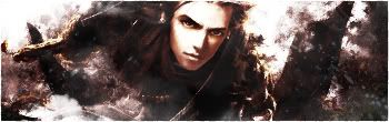
    its too bright, and the text is not smooth at all.. ummm who is that dude anyway?

  6. #6
    Join Date
    May 2005
    Location
    Manitoba, Canada
    Posts
    724

    Default

    I dont really like the scanlines over the render

  7. #7
    Join Date
    Sep 2005
    Location
    Suburbs Minnesota
    Posts
    433

    Default

    me either i think scanlines would be better everywhere but the render or none of them at all text isn't great looks like a typewriter anyway theres potential there though just needs more pizazz

  8. #8
    Join Date
    Oct 2005
    Posts
    103

    Default

    lol its lil scrappy the rapper.. thanks for the C&C

Posting Permissions

  • You may not post new threads
  • You may not post replies
  • You may not post attachments
  • You may not edit your posts
  •  
Powered by vBadvanced CMPS v4.1.1