GFXVoid Graphic Design Forum

Remove Text Formatting
Loading...

» Online Users: 3,013

0 members and 3,013 guests
No Members online

» Site Navigation

 > FAQ

» Stats

Members: 35,443
Threads: 103,072
Posts: 826,684
Top Poster: cc.RadillacVIII (7,429)
Welcome to our newest member, Lekelindids
Page 1 of 2 12 LastLast
Results 1 to 10 of 11

Thread: SIG

  1. #1
    Join Date
    Dec 2005
    Posts
    49

  2. #2
    Join Date
    Jan 2006
    Posts
    17

    Default

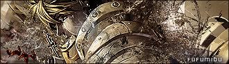
    pretty cool.. not too fond of the text u used tho.. either the color or just the font itself seems unnatural or soemthing..

  3. #3
    Join Date
    Sep 2005
    Location
    Suburbs Minnesota
    Posts
    433

    Default

    looks good but text needs tiny bit of work otherwise looks great

  4. #4
    Join Date
    Aug 2005
    Posts
    299

    Default

    well smudged, but the text throws it waaaaaaaaay off balance,nice job though

  5. #5
    Join Date
    Apr 2005
    Location
    NSW, Australia
    Posts
    1,511

    Default

    text sucks, fix it up and that sig will be sweet


  6. #6
    Join Date
    Dec 2005
    Posts
    49

    Default

    will do

  7. #7
    Join Date
    Dec 2005
    Posts
    556

    Default

    needs an empty spot, and typo needs to improve.

  8. #8
    Join Date
    Aug 2005
    Location
    Nyköping, Sweden
    Posts
    1,908

    Default

    too much going on, need negative space
    text needs work

  9. #9
    Join Date
    Jan 2006
    Posts
    19

    Default

    Very impresive imo. What is that style, im looking for a new one. I'm pretty new to ps. Just looking for another style instead of grunge.

  10. #10
    Join Date
    Apr 2005
    Posts
    1,287

    Default

    Wow text is really bad. Umm, smudging it ok, just a little overdone maybe

    great render

Posting Permissions

  • You may not post new threads
  • You may not post replies
  • You may not post attachments
  • You may not edit your posts
  •  
Powered by vBadvanced CMPS v4.1.1