GFXVoid Graphic Design Forum

Remove Text Formatting
Loading...

» Online Users: 8,425

0 members and 8,425 guests
No Members online

» Site Navigation

 > FAQ

» Stats

Members: 35,443
Threads: 103,072
Posts: 826,684
Top Poster: cc.RadillacVIII (7,429)
Welcome to our newest member, Lekelindids
Results 1 to 5 of 5

Thread: Sidewinder.

  1. #1
    Join Date
    Apr 2006
    Location
    Slatington, Pennsylvania, United States.
    Posts
    94

    Default


    >___>

    1) -=Prepares to get ripped apart.=-

    2)

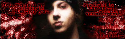
    Avenged Sevenfold - Sidewinder are what the lyrics are from. I don't know where exactly I got the picture from; but my friend linked it to me and I saved it. It was from some imageshack.com host if I'm not mistaken. Though, the image wasn't exactly cut-out into a render.. So that wasn't exactly easy to deal with for the most part.

    It features Zacky Vengeance from the band.

    3) A friend of mine recently inspired me to mess around the text some. Instead of doing what I normally did.

  2. #2
    Join Date
    Apr 2005
    Location
    Singer Island, FL
    Posts
    5,206

    Default

    The background is nice but the render isn’t blended very well. The text in itself is horrible and there is WAY to much of it.

  3. #3
    Join Date
    Apr 2006
    Location
    Slatington, Pennsylvania, United States.
    Posts
    94

    Default

    That wasn't as bad as I thought. o.o

    However, the render itself was unspeakably dark, and I hadn't felt too much like Lighten so many duplicated layers - however I found out it was lightened in just acouple of layers [ probably different then what most people do. ] More or less so, it's meant to just mostly black around the center of it.

    XP!!

    Howeeeeeeever.

    >_>; I didn't think the text was that bad. XD But I'll take that into consideration next time around. =3

  4. #4
    Join Date
    Apr 2005
    Location
    Springfield, MO
    Posts
    1,736

    Default

    The typo is kind of poor but I like the style of it. It just doesn't really fit the size of the sig. Though A larger canvas where it could be more spread out and worked better into the sig it would look rather nice.

    Background is abit random and all over the place and really lacks interesting transitions in color. Which is a pretty normal problem most newer people have so its not a big deal.

    Its really not to bad though. =)

  5. #5
    Join Date
    Jun 2005
    Location
    U.K.
    Posts
    3,462

    Default

    you need... negative space! =)
    don't worry bout text atm... and working with better quality stocks really helps

Posting Permissions

  • You may not post new threads
  • You may not post replies
  • You may not post attachments
  • You may not edit your posts
  •  
Powered by vBadvanced CMPS v4.1.1