GFXVoid Graphic Design Forum

Remove Text Formatting
Loading...

» Online Users: 4,396

0 members and 4,396 guests
No Members online

» Site Navigation

 > FAQ

» Stats

Members: 35,443
Threads: 103,072
Posts: 826,684
Top Poster: cc.RadillacVIII (7,429)
Welcome to our newest member, Lekelindids
Results 1 to 9 of 9

Thread: el-ko sig

  1. #1
    Join Date
    Jul 2005
    Location
    uk/Huddz....BiH/Kljuc
    Posts
    131

    Default

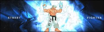
    here is something i been messing about on ps..

    c&c?


  2. #2
    Join Date
    Apr 2006
    Location
    Salford
    Posts
    114

    Default

    Nice effect, i just cant really tell what it is, and those white lines really do not fit.

  3. #3
    Join Date
    Jul 2005
    Location
    uk/Huddz....BiH/Kljuc
    Posts
    131

    Default

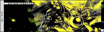
    here is something aswell


  4. #4
    Join Date
    Apr 2006
    Location
    Salford
    Posts
    114

    Default

    Now i like that.

  5. #5
    Join Date
    Jul 2005
    Location
    uk/Huddz....BiH/Kljuc
    Posts
    131

    Default

    ThNKX aNy More CoMents

  6. #6
    Join Date
    Mar 2006
    Posts
    52

    Default

    the 1st the white lines dont fit in and its a lil to yelow imo, other than that is good like that effect

    the street-fighter, ur name is well blended in imo and the SF txt if good to but something is missing in the bg maybe sharp it up a lil?

    nice sig´s 8/10 both

  7. #7
    Join Date
    Feb 2006
    Posts
    368

    Default

    The first one is hot. Cool colors.

  8. #8
    Join Date
    Jul 2005
    Location
    uk/Huddz....BiH/Kljuc
    Posts
    131

    Default

    Thankx ppl..

    Any more..

  9. #9
    Join Date
    Jul 2005
    Location
    uk/Huddz....BiH/Kljuc
    Posts
    131

    Default

    Bump

Posting Permissions

  • You may not post new threads
  • You may not post replies
  • You may not post attachments
  • You may not edit your posts
  •  
Powered by vBadvanced CMPS v4.1.1