GFXVoid Graphic Design Forum

Remove Text Formatting
Loading...

» Online Users: 6,583

0 members and 6,583 guests
No Members online

» Site Navigation

 > FAQ

» Stats

Members: 35,443
Threads: 103,072
Posts: 826,684
Top Poster: cc.RadillacVIII (7,429)
Welcome to our newest member, Lekelindids
Results 1 to 10 of 10
  1. #1

    Default


    What do you guys think?

  2. #2
    Join Date
    Jun 2006
    Posts
    28

    Default

    The second is definitely my fave out of the two. I love the everything about it..especially the colors. Number one is really well done too.

  3. #3

    Default

    ^^^Thanks for the feedback. If you have any suggestions please post them up.

  4. #4
    Join Date
    Jun 2006
    Posts
    28

    Default

    I honestly wouldn't change either of them except I would add a border to them...but thats omly because I'm a border crazed woman lol...

  5. #5
    Join Date
    Apr 2005
    Posts
    1,891

    Default

    There are plenty of tuts in our tutorials section ^o^


  6. #6
    Join Date
    Oct 2005
    Posts
    88

    Default

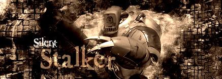
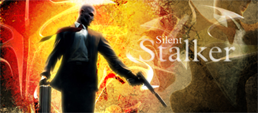
    I duno why, but I think Pyramid Head from Silent Hill would be a lot better in the first one. It is pretty nice as it is though. Overall, first is better, but the colors in the second one are hot.

  7. #7
    Join Date
    Jun 2006
    Location
    Canada
    Posts
    3

    Default

    their is nothing wrong with it..lookin decent

  8. #8

    Default

    There are plenty of tuts in our tutorials section ^o^
    [/b]
    What are you trying to say? You saying I suck and need to follow tutorials LOL?

  9. #9
    Join Date
    Apr 2005
    Location
    Scotland
    Posts
    2,177

    Default

    i think mayb the guy above thot you could strengthen on certain areas. I think the sigs are alright but for example the render in ur hitman one doesn't reallly blend and also the text.
    I think overall the sigs are nice just needs some tightening up. Hope that helped a bit better

  10. #10

    Default

    i think mayb the guy above thot you could strengthen on certain areas. I think the sigs are alright but for example the render in ur hitman one doesn't reallly blend and also the text.
    I think overall the sigs are nice just needs some tightening up. Hope that helped a bit better
    [/b]
    Yes, that was much more informative than just saying, "there are plenty of tutorials here." Thanks for the help.

Posting Permissions

  • You may not post new threads
  • You may not post replies
  • You may not post attachments
  • You may not edit your posts
  •  
Powered by vBadvanced CMPS v4.1.1