0 members and 414 guests
No Members online

» Site Navigation

» Stats
Members: 35,443
Threads: 103,072
Posts: 826,684
Top Poster: cc.RadillacVIII (7,429)
|
-

I lol'd too.
But.. here's my backup statements.
Wow, first off, my signature is a cut from a large piece I made previously. It is just previewing and featuring what I have in my DeviantArt, hence the DevaintArt link in the signature.[/b]
I know I saw it when you first presented it here. http://www.climb-x.com/index.php?showtopic=16205
The pixel font you used isnt meant to be blurry and stretched looking. Turn Anti-Aliasing (AA) to Off, and use a smaller font size, trust me. It'll look more like a pixel font. Just try it, you'll like the result much more and thank me later down the line.[/b]
It's not stretched.. that's the font. As for blurry and smaller, can I ask what screen resolution you are using?
And your coloring is way off. The type of green doesnt even match, and also you threw in a purple-ish red-ish color that I think is downright ugly. And you making "no lighting" then getting mad when I said the lighting is horrible. Just say "yeah I know" next time after. It'll make it much more simpler for the future.[/b]
Here I just straight disagree with you. The colours blend fine for me and again I didn't use "lighting" I brushed it.
Also, how would I know this is a 15-minute slap together signature if you didnt forewarn me. Next time include that in the description of the piece you are showing off. This way there is no confusion of how much effort you really put into it.[/b]
Read the first post in the thread again:
A very quick turtles sig I couldn't resist making for fun
Talking about effort, thats what I meant by recherche. It pretty much means "putting effort into what you do". So by me saying the recherche was all wrong. I am saying that you put no effort into making the sig, therefore it is a signature lacking details and it is ugly.[/b]
That's ok.. If that's your opinion that's fine. That's not what recherche means though.
http://dictionary.reference.com/browse/recherche
And those numbers were slapped on there to make it have something else to look at other than a flat background. Speaking of which, try it with a more complex depth-filled background and see if you like it more before you assume a flat non-depth background will be better. The numbers should be filled up with something else. Maybe a symbol to show that Leonardo (the turtle) is the leader of the group.[/b]
I didn't assume anything it is something I have learned through experience, you're right about the numbers and I already said so.
Also, your experience of 2 years has nothing to do with anything here. If you are still making signatures and other arts like you just started, why try to pursuad me that you are better because you've been making crappy art (sorry but true) even after 2 years?[/b]
Comments from the grand total THREE other sigs I have posted on this site in the last year (all this month):
BustA:
i love the boldness of your sigs, its nice man gj
thats pretty sweet man i like it. gj
Strawberrie:
i quite like it simple lookingish but stuff it i love it =D
Elektrik:
That is ownage. Very talented!
Chriz:
very nice smile.gif
Kyoushima:
Looking good man
nyhl
nice job man, I like that alot
Purified-Concepts
Cool, good stuff.
Love it
Jack:
It's interesting. Definitely different, which I congradulate you on. You get an E-high five.
YOU!:
Great job[/b]
Either they're all wrong (including your own comment) or you're just talking out your ass to try and make a point.
I have also been designing for 2+ years and yes, I believe that I am better than you at designing.
[/b]
Believe what you want.
-
static is completely correct . the tag is plain and simple and ive seen better tags put together in 10 minutes . text is bad , bg is bad , border is lol worthy ,and why if your going to have 1 sword poping out dont you have the other o.O ? arg .
-
why if your going to have 1 sword poping out dont you have the other o.O ? arg .
[/b]
Go up the post and click the original screenshot and you'll see why.. that's the edge of the image.
And again.. it WAS put together in about ten minutes.
Thx for the other crits.
-
umm ... where did u get those great coomments from ? cuz i dont c them here o.O
-
-
Although this seems to be a bit more civilized than most disagreements, I think people here still need to chill a little bit. This is a pretty pointless arguement if you ask me and we're getting nowhere. Jef, although myst's comment may have been sarcastic or posted with ill intent, you can't really prove that over the internet. Looking at it, he didn't say anything wrong, he just expressed his opinion. Afterwards, you threw a couple harsh words his way. I don't think anybody said anything worthy of punishment, but I do think that people need to take a deep breath 
If you guys really want to compare your skill, then take it to the battle section and take your time making a nice piece to compete with.
Finally, I don't like the signature much to be honest. I know you did it for fun, so it's all good, I just have never really liked the pop out style or pixel fonts for that matter. I'm excited for the movie though ;D
-
Looking at it, he didn't say anything wrong, he just expressed his opinion.
[/b]
Actually no... he copy/pasted my criticism of his work in this thread:
http://www.climb-x.com/index.php?showtopic=16299
That's why I reacted. I don't mind negative comments, but I don't like it when people have some axe to grind. If he had just have given his honest opinion of why he didn't like it, as others, yourself included, have done, then I wouldn't have had a problem.
On everything else though, yeah... point taken.
You can lock this now, I doubt any useful comments are going to be made over and above what has already been said.
-
Maybe he used your qoute to describe your piece. Maybe he thought it was "I don't like how blurry it is or the BG, or the colours or all the negative space.. or pretty much anything about it, sorry."
And dude wtf, I dont care if someone liked 1 of your sigs. Even I can make a great sig then the next day make a piece of shit which obviously you have done.
And if its make you feel more powerful to correct everyone here on their comments and critism then dont ask for it or post your work on a forum where you are going to get some.
AND IM TELLING YOU TO GRAB YOUR FONT AND TURN AA OFF ON TEXT AND LOOK AT IT! TRUST ME ITLL LOOK 10X BETTER.
-
call me a 'n00b' when you dont even know how to use a pixel font correctly
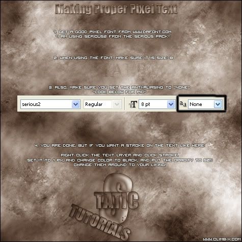
thats what your ****ing noob font is supposed to look like prick
-
That's not how we shut up now is it n00b?
Go find a tutorial on that..
idiot
I laugh at you.
this is me laughing at you being a n00b:
:lol:
This is you
:unsure: I am teh pwn cos I can do text if I follow a tut! :blink:
 Posting Permissions
- You may not post new threads
- You may not post replies
- You may not post attachments
- You may not edit your posts
-
Forum Rules
|


