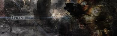
This is my latest signature..i didnt have time to really make a good text and blend it in but here it is...please comment..
|
|


Loading...
|
» Online Users: 3,239
|
Results 1 to 6 of 6
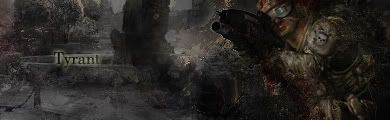
Thread: Tyrant
Similar Threads
|


 Reply With Quote