GFXVoid Graphic Design Forum

Remove Text Formatting
Loading...

» Online Users: 425

0 members and 425 guests
No Members online

» Site Navigation

 > FAQ

» Stats

Members: 35,443
Threads: 103,072
Posts: 826,684
Top Poster: cc.RadillacVIII (7,429)
Welcome to our newest member, Lekelindids
Results 1 to 7 of 7
  1. #1

    Default Ghost Face Take 2


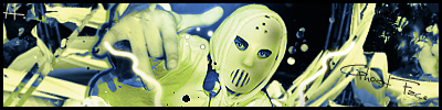
    Redone the lighting, colours and put a blur on his hand added some more text aswell. Better?

  2. #2
    Join Date
    May 2007
    Location
    The States
    Posts
    674

    Default

    Eh Personally I don't like

  3. #3
    Join Date
    Aug 2005
    Location
    HK
    Posts
    2,353

    Default

    Way better, but what the heck is that squiggly line doing there?


    <3 Fuzzy

  4. #4
    Join Date
    Jul 2005
    Posts
    4,368

    Default

    i dont like it personaly... looks like u've inverted it or something.


    Death from above!


    (: PPPPINK!!!!!

  5. #5
    Join Date
    May 2007
    Posts
    100

    Default

    Hmmm i don't like it, Chucks the Squggly Line is meant to be lightning

    From Chucks ;P TY!

  6. #6
    Join Date
    Aug 2005
    Location
    HK
    Posts
    2,353

    Default

    lightning.. from his pinky? LOL


    <3 Fuzzy

  7. #7

    Default

    it's just detail.. and no1 can say its monotone now

Similar Threads

  1. Azteca Map
    By tacoX in forum Digital Art
    Replies: 0
    Last Post: 06-08-2005, 03:22 PM
  2. New Sig
    By KRAZEE in forum Sigs & Manips
    Replies: 4
    Last Post: 04-14-2005, 08:05 PM

Posting Permissions

  • You may not post new threads
  • You may not post replies
  • You may not post attachments
  • You may not edit your posts
  •  
Powered by vBadvanced CMPS v4.1.1