GFXVoid Graphic Design Forum

Remove Text Formatting
Loading...

» Online Users: 5,591

0 members and 5,591 guests
No Members online

» Site Navigation

 > FAQ

» Stats

Members: 35,443
Threads: 103,072
Posts: 826,684
Top Poster: cc.RadillacVIII (7,429)
Welcome to our newest member, Lekelindids
Results 1 to 10 of 10

Thread: 2 New Ones.

  1. #1
    Join Date
    Mar 2005
    Posts
    72

    Default


    These sigs were for 2 dif. people...

  2. #2
    Join Date
    Mar 2005
    Posts
    72

    Default


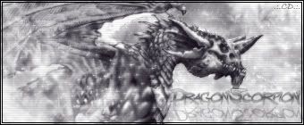
    the avy to the first.

  3. #3
    Join Date
    Apr 2005
    Location
    Texas
    Posts
    3,199

    Default

    I like the 1st one it has a nice feel...but the red on the right seems out of place awsome text..unlike some other people ^_^

    8.75/10 on first
    7.5/10 on second..its kinda just...there
    Creator of the GFXvoid Header......................................Retired GFXvoid Staff.
    Currently: Never Here

  4. #4
    Join Date
    Feb 2005
    Location
    Land of DOOM MINES
    Posts
    951

    Default

    both of them look good..just maybe blend the character render on the first one a little..and set blending mode to luminosity.

    second one..I would add color..but still looks good and nice job reflecting text...sorta looks like glass.

  5. #5
    Join Date
    Apr 2005
    Location
    here. r ewe blind
    Posts
    328

    Default

    not bad like both ya renders

  6. #6
    Join Date
    Apr 2005
    Location
    Texas
    Posts
    3,199

    Default

    Im starting to like the 2nd one ^_^ good job its got an icey feel
    Creator of the GFXvoid Header......................................Retired GFXvoid Staff.
    Currently: Never Here

  7. #7
    Join Date
    Feb 2005
    Location
    Fort Wayne, Indiana
    Posts
    7,057

    Default

    Good job...i like them both...just need some changes that everyone recromended, i hope you u get better

  8. #8
    Join Date
    Mar 2005
    Location
    Montreal, Canada
    Posts
    145

    Default

    Too Much Blur? No?
    Im not sayin that ya work sux..NOOO!! Its very nice
    U did a great job dude. I like the 2nd one..Icey effect u kno :P
    Peace Out B)

  9. #9
    Join Date
    Feb 2005
    Posts
    84

    Default

    i really like the first the second one if alright.

  10. #10
    Join Date
    Apr 2005
    Posts
    21

    Default

    well actually they both r nice but second 1 is more effective and attractive if u ask me.

Posting Permissions

  • You may not post new threads
  • You may not post replies
  • You may not post attachments
  • You may not edit your posts
  •  
Powered by vBadvanced CMPS v4.1.1