GFXVoid Graphic Design Forum

Remove Text Formatting
Loading...

» Online Users: 6,481

0 members and 6,481 guests
No Members online

» Site Navigation

 > FAQ

» Stats

Members: 35,443
Threads: 103,072
Posts: 826,684
Top Poster: cc.RadillacVIII (7,429)
Welcome to our newest member, Lekelindids
Results 1 to 4 of 4
  1. #1
    Join Date
    Jun 2007
    Location
    Kintore!
    Posts
    602

    Default my newest sig pretty random but i like it, very simple tho

    the random sig >

  2. #2
    Join Date
    Jun 2007
    Posts
    231

    Default

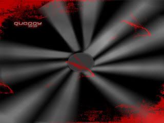
    If the middle had a bight light source this might look good.

  3. #3

    Default

    This won't solve much, but I feel the need to warn you for future-reference:
    When using Bevel and Emboss on text, move the "size" to "0". It looks much better.


    ... With the exception of this stamp.

  4. #4
    Join Date
    Jul 2005
    Posts
    4,368

    Default

    hmmm its different and like dcn said i think that a bright center would look better.


    Death from above!


    (: PPPPINK!!!!!

Similar Threads

  1. Wuts Up
    By Salty in forum Introductions
    Replies: 5
    Last Post: 10-11-2005, 11:04 AM
  2. Sunrise Silhouette
    By robgasm in forum Digital Art
    Replies: 4
    Last Post: 05-28-2005, 01:45 PM

Posting Permissions

  • You may not post new threads
  • You may not post replies
  • You may not post attachments
  • You may not edit your posts
  •  
Powered by vBadvanced CMPS v4.1.1