GFXVoid Graphic Design Forum

Remove Text Formatting
Loading...

» Online Users: 1,768

0 members and 1,768 guests
No Members online

» Site Navigation

 > FAQ

» Stats

Members: 35,443
Threads: 103,072
Posts: 826,684
Top Poster: cc.RadillacVIII (7,429)
Welcome to our newest member, Lekelindids
Results 1 to 8 of 8

Thread: car sig

  1. #1
    Join Date
    Jun 2007
    Location
    Kintore!
    Posts
    602

  2. #2
    Join Date
    Jul 2005
    Posts
    4,368

    Default

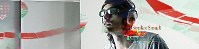
    not bad as i said on msn... text needs work tho


    Death from above!


    (: PPPPINK!!!!!

  3. #3
    Join Date
    Jun 2007
    Location
    Kintore!
    Posts
    602

    Default

    yeh i jus wapped in sum text, lol, was gonna leave it without it but i jus thot i'd wap my name in, lol

  4. #4
    Join Date
    Aug 2007
    Location
    Kemnay, Scotland ...the best place in the world!
    Posts
    268

    Default

    nt bad but my bro is right the text doesn't fit but not much else to say about it !
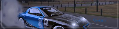
    Latest
    -------


    -------


  5. #5
    Join Date
    Aug 2005
    Location
    HK
    Posts
    2,353

    Default

    The smoke needs more work.. it looks flat at the moment. Nice idea though


    <3 Fuzzy

  6. #6
    Join Date
    Jun 2007
    Location
    Kintore!
    Posts
    602

  7. #7
    Join Date
    Jul 2005
    Posts
    4,368

    Default

    smoke is looking better... could do with a couple of lighter bits in it too.


    Death from above!


    (: PPPPINK!!!!!

  8. #8
    Join Date
    Jun 2007
    Location
    Kintore!
    Posts
    602

    Default

    lol, the more i look at this one the more i don't like it to be honest.

Posting Permissions

  • You may not post new threads
  • You may not post replies
  • You may not post attachments
  • You may not edit your posts
  •  
Powered by vBadvanced CMPS v4.1.1