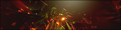
changed a bit.....
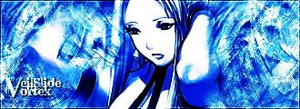
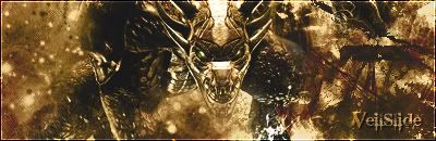
its too overcontrasted and mono... also im not a fan of anime... but its got an alright flow and stuff in the bg... definatly oldschool tho.
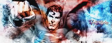
Death from above! (: PPPPINK!!!!!
the main reason to make this was to try out the text tut that i found in the forum....forgot who made it..
well the text looks fine lol :P fits the grundgy feel of the sig.
Looks good, but the extreme color and contrast make it way too harsh.
Coming Soon
Work on the coloring mate!
Forum Rules


 Reply With Quote