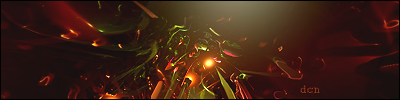
the colors seem awkward
its an unusual mix
i mean it doesnt look bad
it just feels... weird
but from what i can tell all looks well
good work
"The only verdict is vengeance; a vendetta, held as a votive, not in vain,
for the value and veracity of such shall one day vindicate
the vigilant and the virtuous." - V
"Roll dat shyt, lite dat shyt, smoke it" - Method Man
the colors seem awkward
its an unusual mix
i mean it doesnt look bad
it just feels... weird
but from what i can tell all looks well
good work
Demon seems to have problems with the colors on almost all of my previous tags, e.g.
Originally Posted by Smiling Demon
too monotoned...
...so I thought I should spice up this one with weird funny/cool colors. It was originally monotoned-ish but I changed it just to shut my 'dad' up . But thanks for the feedback, much appreciated!


 Reply With Quote


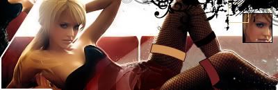

 ... With the exception of this stamp.
 . But thanks for the feedback, much appreciated!