GFXVoid Graphic Design Forum

Remove Text Formatting
Loading...

» Online Users: 5,496

0 members and 5,496 guests
No Members online

» Site Navigation

 > FAQ

» Stats

Members: 35,443
Threads: 103,072
Posts: 826,684
Top Poster: cc.RadillacVIII (7,429)
Welcome to our newest member, Lekelindids
Results 1 to 5 of 5

Thread: Predator Sig

  1. #1

    Default Predator Sig

    v1


    v2
    /~YoU lAuGh BcUz Am DiFfErEnT i LaUgH bEcAuSe Ur AlL tHe SaMe~/


  2. #2
    Join Date
    Sep 2005
    Posts
    168

    Default

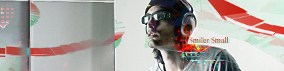
    The focal needs to be the center of attention and text needs to be smaller. I like the effects tho and think there is definitley potential.

  3. #3
    Join Date
    Aug 2007
    Location
    Kemnay, Scotland ...the best place in the world!
    Posts
    268

    Default

    v1 is better dont like the predator bein repeated, cool effects but yeh the writing is well too big but not bad keep it up
    Latest
    -------


    -------


  4. #4
    Join Date
    Jan 2008
    Location
    Portugal
    Posts
    200

    Default

    what they said, plus add a border, and try working in colored versions, then you can try and see if they looks good on B/W

  5. #5

    Default

    Thanx! Will keep in mind...
    /~YoU lAuGh BcUz Am DiFfErEnT i LaUgH bEcAuSe Ur AlL tHe SaMe~/


Similar Threads

  1. New Signature
    By VizuaL in forum Sigs & Manips
    Replies: 1
    Last Post: 09-30-2005, 12:56 AM
  2. new site
    By jamez in forum Digital Art
    Replies: 5
    Last Post: 05-19-2005, 12:43 PM
  3. Final Fantasy
    By Juicy in forum Sigs & Manips
    Replies: 6
    Last Post: 05-17-2005, 05:53 PM
  4. 2 new sig!!!
    By t-k in forum Sigs & Manips
    Replies: 4
    Last Post: 03-28-2005, 09:49 PM

Posting Permissions

  • You may not post new threads
  • You may not post replies
  • You may not post attachments
  • You may not edit your posts
  •  
Powered by vBadvanced CMPS v4.1.1