0 members and 824 guests
No Members online

» Site Navigation

» Stats
Members: 35,443
Threads: 103,072
Posts: 826,684
Top Poster: cc.RadillacVIII (7,429)
|
-
 Misunderstood. Misunderstood.
-
Wow, is this a non-empty sig from ratchet? :P
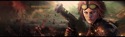
Nice effects and lighting, love the text; though i think the render could use some blending. Nice work man 
-
 Originally Posted by Aristodemus

Wow, is this a non-empty sig from ratchet? :P
Nice effects and lighting, love the text; though i think the render could use some blending. Nice work man
Twas a stock 
Anyway yeah i thought i'd fill this one up a bit xD
-
Pretty interesting.
I find I like it 
-
Very cool! this is your best yet IMO. The Bg really works and you did good with the effects. Next time try to make the clipping masks (the splatter brushes) a bit bigger rather than more dotty and everywhere, it works better IMO.
Also compositionaly i think you should scoot the focal over more towards the center a bit. but the text is nice. good job
 My DevART
RATCHET is my bitch
Andrew says:
u ever stolen a bible?
Apathy says:
no
used the last two pages to roll a joint though
Andrew says:
wow
thats fucking hard core
^^HAHAHA, dm sucks XD
-
great piece of work, both color and lighting are great, the splatter effects are good.
gj.
 Posting Permissions
- You may not post new threads
- You may not post replies
- You may not post attachments
- You may not edit your posts
-
Forum Rules
|


 Reply With Quote


