GFXVoid Graphic Design Forum

Remove Text Formatting
Loading...

» Online Users: 8,258

0 members and 8,258 guests
No Members online

» Site Navigation

 > FAQ

» Stats

Members: 35,443
Threads: 103,072
Posts: 826,684
Top Poster: cc.RadillacVIII (7,429)
Welcome to our newest member, Lekelindids
Results 1 to 5 of 5

Thread: The End

  1. #1
    Join Date
    Mar 2008
    Location
    Mexico
    Posts
    391

    Default The End

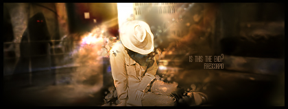
    this is my newest sig xD lawl i even wrote a little something about it i feel like i unrsuted but idk xD what are ur opinions on this 1 guys


    as the lights grew dimmer he layed on the floor as the impending shadow of the inevitable drew near by every beat of his heart, his only thoughts where:so this is the end?
    newest:

    Fav :


    The true and only Firescorpio!
    (no autographs please)


  2. #2
    Join Date
    Feb 2008
    Location
    Toronto, Canada
    Posts
    4,831

    Default

    def looking a little better...one problem...
    just i can' read the text...


  3. #3
    Join Date
    May 2008
    Location
    Good ol' Pennsylvania
    Posts
    893

    Default

    the little story helped me figure out the text, not sure if i would have known otherwise; I like it though, all your sigs are beautiful imo just something about em

  4. #4

    Default

    lighting is a teeny bit strong imo, but other than that its fine...
    gj =]

  5. #5
    Join Date
    Mar 2007
    Location
    Denmark
    Posts
    4,197

    Default

    I think that it is overall a good sig, bg is good kewl effects but the dude thats sitting is a shitty focal point because we can only see his hat, that throws me of


Posting Permissions

  • You may not post new threads
  • You may not post replies
  • You may not post attachments
  • You may not edit your posts
  •  
Powered by vBadvanced CMPS v4.1.1