Wow, you should current that, definately your best yet.
Fav: M-Birds = Godly
oh my god, the beauty, the perfection, I luve it! Definitely the most innovative signature I have seen in a while.
Lolbot sayz: Go to my Deviant page! Message of the 'whatever I like it to be' "The pen is mightier than the sword, if you shoot that pen out of a gun."
Thanks guys
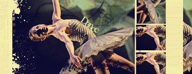
Keeping to the same style
Originally Posted by Lauren Keeping to the same style Try and make the pink flow to purple a bit smoother. also whats with the black bit at the end?
It was the way the stock was. I fixed the weirdness of the corners.
Last edited by Lauren; 07-11-2008 at 02:00 PM.
Forum Rules


 Reply With Quote