0 members and 3,554 guests
No Members online

» Site Navigation

» Stats
Members: 35,443
Threads: 103,072
Posts: 826,684
Top Poster: cc.RadillacVIII (7,429)
|
-
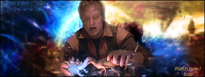
 New Wash Sig! New Wash Sig!
Okay, so I think this one came out really good o.O. What do you guys think?
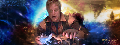
Version 2 now:
Last edited by Jean Hughes; 07-10-2008 at 09:56 PM.
~It randomizes them  ~ ~
-
Not bad!
I don't get it though. Why is he in some random colored dust cloud in front of a building, playing with dinosaurs?
Haha, just dosen't make sense to me.
But the effects are good and such!
-
wierd choice of render...
but nice style...
-
My main criticism of the sig is the contrast, I think it's a bit much on the background, and not enough on the render. I recognise the render from somewhere...TV or film...
Great effects, and interesting composition  , but I think the contrast of it robs some of the detail. , but I think the contrast of it robs some of the detail.
My suggestions:
Up the contrast a little bit on the render
Subdue the contrast a little bit on the background (probably not much)
Sharpen the render, unless it becomes too grainy.
   Religion gives nothing in life, only in death.
-
It's Wash from Firefly (A series)... and Serenity (The movie made after the series) . I chose that render because he's my favorite character.
Hmm, I did sharpen the render a bit. And yeah, I realized the render was also kind of dark when I was using it, lol. Thanks guys!
EDIT: Okay, I lowered the contrast a bit on the background, and upped his contrast. I think it looks better !
Last edited by Jean Hughes; 07-10-2008 at 09:58 PM.
~It randomizes them ~
-
Lol, Wash is the man, behind the Captain of course.
I think my issues is that the colors don't blend well.
One kind of just stops and the other starts.
 Posting Permissions
- You may not post new threads
- You may not post replies
- You may not post attachments
- You may not edit your posts
-
Forum Rules
|


 Reply With Quote


