0 members and 544 guests
No Members online

» Site Navigation

» Stats
Members: 35,443
Threads: 103,072
Posts: 826,684
Top Poster: cc.RadillacVIII (7,429)
|
-
-

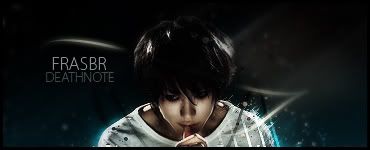
that's a nice piece dude..right side of master chief looks lil more blended than the left side..KIU
Personal Favourite:

Latest:

-
There seems to be a lot going on in this. I don't know if it's because there is soo many colors, or if it's because there just a lot going on. I think a little of both. If you add some gradient maps set to blending options liek soft ligth and hue and normal, at liek 5 % it will help make the color more unified. Also photo filters and colro balances help too.
Great text placement! I was thinking..does master chief have a tag like that on his shoulder???? After while i figured it out. Nice one!
Juniad is right tho, rigth side needs to be beldned more. I also think you should blur SOME of the BG and Sharoen the render.
Finally The light seems to dull for me. Make it a bit brighter, but erase it over master chiefs head, his head is already blown out, and i don't see much light around it XD.
Nice job on text though.
 My DevART
RATCHET is my bitch
Andrew says:
u ever stolen a bible?
Apathy says:
no
used the last two pages to roll a joint though
Andrew says:
wow
thats fucking hard core
^^HAHAHA, dm sucks XD
-
nice. As stated by yourself, a little too much going on, but i like it too  keep up the good work keep up the good work
Favourite
.__FrasbR__.
-
haha , i finally was like ok i need to make the text good on this one haha , im glad is doesnt look horrible 
ill give it some tweaking and update it tomorrow . THANKS GUYS!!
Recent :
[img]  [/img]

 Posting Permissions
- You may not post new threads
- You may not post replies
- You may not post attachments
- You may not edit your posts
-
Forum Rules
|


 Reply With Quote
