GFXVoid Graphic Design Forum

Remove Text Formatting
Loading...

» Online Users: 710

0 members and 710 guests
No Members online

» Site Navigation

 > FAQ

» Stats

Members: 35,443
Threads: 103,072
Posts: 826,684
Top Poster: cc.RadillacVIII (7,429)
Welcome to our newest member, Lekelindids
Results 1 to 4 of 4
  1. #1
    Join Date
    Jul 2008
    Posts
    25

    Default my first sig w.o tut.

    without a tut is a small lie.. kinda.. but not really..
    i used what i learned from several tuts ive used since being here n kinda.. mushed them all in one.. so yeah.. w.o a tut..


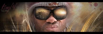
    i know ill cop something for the text but it was for a friend n he wanted tht shizz on there. and thats the only hancock render on planet renders so every is prolly over it.. but this is something a lil diff...


    anywho.. CnC plz

    EDIT:

    ...versions 1 through 6...


    Last edited by T-MaKK; 07-19-2008 at 10:10 AM.

  2. #2
    Join Date
    Jul 2008
    Location
    UK
    Posts
    125

    Default

    version 6>>>

    text needs alotta work..not bad for first w.o a tut
    Personal Favourite:


    Latest:


  3. #3
    Join Date
    Jan 2007
    Location
    Minnesota
    Posts
    5,091

    Default

    Not bad without a tut. IMO Theres wayy too much text. get rid of all the black line sof text and at the boittom the part about an asshole. You don't need it. Anyone who has seen it already knows it's implied.

    IMO V5 is best. But it's a bit tooo orangy. Asaide from having a ton of text. The text in the top corner is nice. So good job on that. WOrk on your blending and effects. ALso you could easily do without the splatters in the top right of the sig.

    Not bad though for sure for a first without a tut.


    My DevART
    RATCHET is my bitch
    Andrew says:
    u ever stolen a bible?
    Apathy says:
    no
    used the last two pages to roll a joint though
    Andrew says:
    wow
    thats fucking hard core
    ^^HAHAHA, dm sucks XD


  4. #4
    Join Date
    May 2008
    Location
    Anchorage, AK
    Posts
    440

    Default

    Id agree with Papa, v5 is the best.

    Lighting seems good as well as effects; just make them less transparent but still visible and maybe add a bit more effects around hancock.

    Text is very hard to see as well there does seem to be quite a bit; try to not use blending options on text if thats what you did but instead use a color from the sig and/or render and lower the opacity some if it sticks out too much.

    Though I do like the border alot, it seems to work very well for this sig; keep up the good work mate.
    Fav:

    M-Birds = Godly

Posting Permissions

  • You may not post new threads
  • You may not post replies
  • You may not post attachments
  • You may not edit your posts
  •  
Powered by vBadvanced CMPS v4.1.1