GFXVoid Graphic Design Forum

Remove Text Formatting
Loading...

» Online Users: 8,088

0 members and 8,088 guests
No Members online

» Site Navigation

 > FAQ

» Stats

Members: 35,443
Threads: 103,072
Posts: 826,684
Top Poster: cc.RadillacVIII (7,429)
Welcome to our newest member, Lekelindids
Page 1 of 2 12 LastLast
Results 1 to 10 of 12
  1. #1
    Join Date
    Jul 2008
    Location
    UK
    Posts
    125

    Default The Joker (RIP Heath Ledger)


    Personal Favourite:


    Latest:


  2. #2
    Join Date
    Oct 2007
    Posts
    2,782

    Default

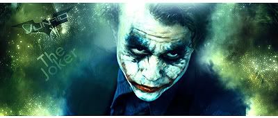
    I feel this should just have a darker tone to it. Blues and blacks. The text is an issue but apart from that it's looking good.


  3. #3
    Join Date
    Jul 2008
    Location
    UK
    Posts
    125

    Default

    lol i know yeah ratchet i gotta agree with u there, i didnt think of that at the time thanks for the feed
    Personal Favourite:


    Latest:


  4. #4
    Join Date
    Feb 2008
    Location
    Toronto, Canada
    Posts
    4,831

    Default

    nice stuff.....i agree with wat ratchet sed but nice attempt...
    props
    the joker was the shit in dark knight...crazy ass movie


  5. #5
    Join Date
    Jul 2005
    Location
    Grudge City Utah
    Posts
    346

    Default

    by far the best movie i have ever seen in my life. depth also needs a little work . keep it up
    Recent :

    [img][/img]


  6. #6
    Join Date
    Mar 2007
    Location
    Denmark
    Posts
    4,197

    Default

    hey i dunno how to explain what i think can i show you quik?


  7. #7
    Join Date
    Jul 2008
    Location
    UK
    Posts
    125

    Default

    ^^Yes please do daemon
    Personal Favourite:


    Latest:


  8. #8
    Join Date
    Oct 2007
    Posts
    2,782

    Default

    Hope you don't mind me doing this.


    I changed the colour by getting a soft brush and picking blues/blacks and purples and painting on a layer so one layer for blue one for black ect. Then set these layers to colour and lower opacity and it should give you the darker feel.

    Give it a try and hit us with and update.


  9. #9
    Join Date
    Mar 2007
    Location
    Denmark
    Posts
    4,197

    Default

    Here is what i did..


  10. #10
    Join Date
    Oct 2007
    Posts
    2,782

    Default

    Quote Originally Posted by Daemon View Post
    Here is what i did..

    Was that the same technique?


Similar Threads

  1. PSD/LRO, Joker Tag
    By Joost in forum Resources
    Replies: 0
    Last Post: 06-15-2008, 12:49 PM
  2. JoKer
    By xDMXx in forum Digital Art
    Replies: 3
    Last Post: 01-20-2008, 09:49 PM
  3. Joker 3.0
    By JoKeRsWiSeHaT in forum Digital Art
    Replies: 6
    Last Post: 10-12-2007, 05:24 AM
  4. Joker. Avy
    By Magnum in forum Digital Art
    Replies: 1
    Last Post: 06-21-2005, 10:27 AM
  5. Joker
    By eLLuSioNiST in forum Sigs & Manips
    Replies: 5
    Last Post: 02-01-2005, 08:39 PM

Posting Permissions

  • You may not post new threads
  • You may not post replies
  • You may not post attachments
  • You may not edit your posts
  •  
Powered by vBadvanced CMPS v4.1.1