GFXVoid Graphic Design Forum

Remove Text Formatting
Loading...

» Online Users: 1,755

0 members and 1,755 guests
No Members online

» Site Navigation

 > FAQ

» Stats

Members: 35,443
Threads: 103,072
Posts: 826,684
Top Poster: cc.RadillacVIII (7,429)
Welcome to our newest member, Lekelindids
Results 1 to 8 of 8

Thread: Dark Knight

  1. #1
    Join Date
    Feb 2008
    Location
    Toronto, Canada
    Posts
    4,831

    Default Dark Knight


    C+C?


  2. #2
    Join Date
    Jul 2007
    Location
    Lithuania
    Posts
    3,611

    Default

    Hello Immortal xDD
    One more signature in this factory xD
    and it looks nice. ;]
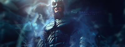
    The text saying The dark night little. .
    OUTSTANDING(?)
    actually dont know how to imporve it.
    maybe lower the opacity.
    The batman symbol dont fit here too, IMO.
    maybe some splatters in BG???
    But sig looks good. ;]


  3. #3

    Default

    hmm it looks good
    except for the batman symbol and the text

    the two fonts don't work together on this sig imo
    and it is to bold, perhaps a lower opacity would help

    and the batman symbol just feels out of place
    i would say put it behind him
    as if it was in the sky (if you get what im saying)

    good overall job though
    just needs alil more work
    †God Bless†


    ~See through eyes, unclouded by hate~

    my deviant art
    http://t-john316-t.deviantart.com/


  4. #4
    Join Date
    Oct 2007
    Posts
    2,782

    Default

    Looks great although the face is a little contrasted so has lost some details. Pretty shweet overall though.


  5. #5
    Join Date
    Jul 2007
    Posts
    1,098

    Default

    Lol, didn't even see the symbol until I read the 1st post, but yea, maybe back right behind his head. It would fill up some empty space there.


  6. #6
    Join Date
    Feb 2008
    Location
    Toronto, Canada
    Posts
    4,831

    Default

    thnx for the comments guys..i'll get workin on a second version

    updated version


    i'm not that good at retouching previously made sigsXD
    Last edited by Immortal.; 07-24-2008 at 02:01 PM.


  7. #7
    Join Date
    Mar 2008
    Location
    Mexico
    Posts
    391

    Default

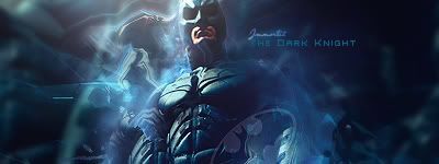
    im posting o.o xD yay! xD lol nice work bro agreed with all the above aside form the text IMO it looked very good on V1 maybe the size the dark knight could looked sexier smaller but IMo the first text looked great awsome stuff as always bro :O
    newest:

    Fav :


    The true and only Firescorpio!
    (no autographs please)


  8. #8
    Join Date
    Feb 2008
    Location
    Toronto, Canada
    Posts
    4,831

    Default

    lol its scorpio..good to see you again bro


Similar Threads

  1. Joker sig (The Dark Knight)
    By Joost in forum Sigs & Manips
    Replies: 3
    Last Post: 06-14-2008, 09:42 AM
  2. Dark Knight
    By Sp!t in forum Sigs & Manips
    Replies: 7
    Last Post: 09-02-2007, 04:52 PM
  3. Knight sig CnC please?
    By Wolf in forum Sigs & Manips
    Replies: 7
    Last Post: 02-11-2007, 10:44 PM
  4. Knight
    By Mr. Kenny in forum Digital Art
    Replies: 22
    Last Post: 01-26-2006, 04:02 PM
  5. kNiGHT.
    By Juicy in forum Sigs & Manips
    Replies: 7
    Last Post: 04-25-2005, 12:40 PM

Posting Permissions

  • You may not post new threads
  • You may not post replies
  • You may not post attachments
  • You may not edit your posts
  •  
Powered by vBadvanced CMPS v4.1.1