GFXVoid Graphic Design Forum

Remove Text Formatting
Loading...

» Online Users: 3,484

0 members and 3,484 guests
No Members online

» Site Navigation

 > FAQ

» Stats

Members: 35,443
Threads: 103,072
Posts: 826,684
Top Poster: cc.RadillacVIII (7,429)
Welcome to our newest member, Lekelindids
Page 1 of 2 12 LastLast
Results 1 to 10 of 12

Thread: Warhamemr Orc

  1. #1
    Join Date
    Jul 2008
    Location
    Missouri, United States
    Posts
    67

    Default Warhamemr Orc

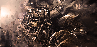
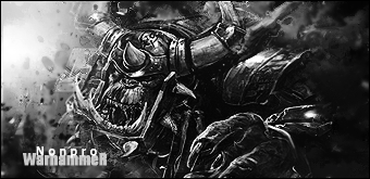
    Typo in the title, supposed to be Warhammer. :P

    I have two versions, Colored, and B&W.

    It's the same style as my last tag.

    Colored:


    B&W:

    Last edited by Nonpro; 07-28-2008 at 10:40 PM.


    ////////////////////////////////////////////////////////////////////////////////////////////////////


  2. #2
    Join Date
    May 2006
    Location
    Canada
    Posts
    556

    Default

    this one is actually like amazing. v1. aside from the text i loooooove it.
    EDIT: you've inspired me. you reminded me how good warhammer art is.
    Last edited by nazz; 07-28-2008 at 11:44 PM.


  3. #3
    Join Date
    Sep 2007
    Posts
    24

    Default

    wow that necron one is sweet ^^

  4. #4
    Join Date
    Jul 2008
    Location
    Missouri, United States
    Posts
    67

    Default

    Not sure if this text is any better, but I think it might be.

    Last edited by Nonpro; 07-29-2008 at 02:42 AM.


    ////////////////////////////////////////////////////////////////////////////////////////////////////


  5. #5
    Join Date
    Sep 2007
    Posts
    24

    Default

    i like your font that you have but the text is a little hard to read cuz it fades out.

  6. #6
    Join Date
    Jul 2008
    Location
    Missouri, United States
    Posts
    67

    Default

    Quote Originally Posted by PC Sheef View Post
    i like your font that you have but the text is a little hard to read cuz it fades out.
    Yeah, I didn't want it to stand out that much because I didn't want it to distract from the actual focal too much. The other versions text was kind of distracting to me.


    ////////////////////////////////////////////////////////////////////////////////////////////////////


  7. #7
    Join Date
    Nov 2007
    Location
    South Wales
    Posts
    470

    Default

    Very cool. I hate Orks in all fiction, but that's an undeniably cool sig. V3 ftw.

    Religion gives nothing in life, only in death.

  8. #8
    Join Date
    Feb 2008
    Location
    Toronto, Canada
    Posts
    4,831

    Default

    very nice...i admire your style man..keep it up


  9. #9
    Join Date
    Oct 2007
    Posts
    2,782

    Default

    Very nice work. Good sig but i think your text needs some work.


  10. #10
    Join Date
    Jan 2007
    Location
    Minnesota
    Posts
    5,091

    Default

    Very cool. Text needs work though. Also next sig you should try to make it really colorful! WHat i've seen from you is black and white and very sepia toned.

    Aside from that though it looks very nice. Great job.


    My DevART
    RATCHET is my bitch
    Andrew says:
    u ever stolen a bible?
    Apathy says:
    no
    used the last two pages to roll a joint though
    Andrew says:
    wow
    thats fucking hard core
    ^^HAHAHA, dm sucks XD


Posting Permissions

  • You may not post new threads
  • You may not post replies
  • You may not post attachments
  • You may not edit your posts
  •  
Powered by vBadvanced CMPS v4.1.1