0 members and 4,038 guests
No Members online

» Site Navigation

» Stats
Members: 35,443
Threads: 103,072
Posts: 826,684
Top Poster: cc.RadillacVIII (7,429)
|
-
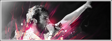
 Uhu! Frank Carter. Uhu! Frank Carter.
huh.
I made one more.
And I feel this one is sooo great. (hope so)
here is my result ;]
hope you like it too.

sexy
-
Looks pretty good overall. Nice blending, render and the text. Simple background, but effective. I don't like the border style though.
-
Love the blending and text. Colours are great too. GJ garis.
-
 Originally Posted by Apathy

Looks pretty good overall. Nice blending, render and the text. Simple background, but effective. I don't like the border style though.
Thanks ;]

Better?
-
I like it, looks very nice.
Frank Carter is the lead vocals in The Gallows, right? If so, I talked to him in a hotel lobby after a day at Warped Tour.

////////////////////////////////////////////////////////////////////////////////////////////////////
-
-
-
text is cool. Effects and blending are awesome. Only problem i can see with it is that it's really monotone. I guess i'm the only one bothered by it though so it can't be too big a deal. Nice job on everything else.
 My DevART
RATCHET is my bitch
Andrew says:
u ever stolen a bible?
Apathy says:
no
used the last two pages to roll a joint though
Andrew says:
wow
thats fucking hard core
^^HAHAHA, dm sucks XD
-
he garis, i really love you sig, its just good no comments i try a bit make a some sig i wear it know but yours is best, and my border sucks:Pbtw
-
i think its a bit monotone..ur smudging is cool tho
effects are decent as well
i love your border style that's amazing
but IMO i think ur text is off...i'd change teh carter part
Similar Threads
-
By Sobek in forum Digital Art
Replies: 4
Last Post: 11-04-2005, 07:51 AM
 Posting Permissions
- You may not post new threads
- You may not post replies
- You may not post attachments
- You may not edit your posts
-
Forum Rules
|


 Reply With Quote