0 members and 3,360 guests
No Members online

» Site Navigation

» Stats
Members: 35,443
Threads: 103,072
Posts: 826,684
Top Poster: cc.RadillacVIII (7,429)
|
-
 300 300
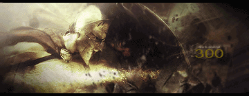
Yeah, got this done, figured I should post it.
-
Nice sig but render doesn't stand as much as it should as the focal maybe sharpen it and u got a nice sig :P
Dan.
-
u got the lighting spot on so props to that.
the text isn't half bad so that's ok too.
its a solid sig i'm not quite sure what i would do.
i feel the size makes the 'wow' factor go down, maybe crop out the right part and add some small text and i thinkit'd be a top notch sig...just my opinion
-
This is really under contrasted. try adding a levels or curves. It will make the color pop and the lighting. IMO it'd make it great.
The text is okay, however i dislike the 300 color.
The blending is great, and the effects are cool too. Just needs more color and contrast.
 My DevART
RATCHET is my bitch
Andrew says:
u ever stolen a bible?
Apathy says:
no
used the last two pages to roll a joint though
Andrew says:
wow
thats fucking hard core
^^HAHAHA, dm sucks XD
-
yea, agree with the above, render needs to pop out more.
Great blending though.
-
 Originally Posted by zole

Nice sig but render doesn't stand as much as it should as the focal maybe sharpen it and u got a nice sig :P
Dan.
Thanks. 
Originally Posted by Immortal.
u got the lighting spot on so props to that.
the text isn't half bad so that's ok too.
its a solid sig i'm not quite sure what i would do.
i feel the size makes the 'wow' factor go down, maybe crop out the right part and add some small text and i think it'd be a top notch sig...just my opinion
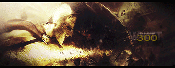
Hmm, size, huh? Think I'll recrop it and see what works.
Originally Posted by Papa
This is really under contrasted. try adding a levels or curves. It will make the color pop and the lighting. IMO it'd make it great.
The text is okay, however i dislike the 300 color.
The blending is great, and the effects are cool too. Just needs more color and contrast.
Alright, thanks for the tips. I'll be sure to do so.
Originally Posted by Studhorse
yea, agree with the above, render needs to pop out more.
Great blending though.
Thanks for comment, guys.
-
Needs:
Color, contrast, maybe a bit of sharpening - and it would help if I could read the text. (lighter color on the text would be better too)
What's great:
Lighting, depth (just a bit of sharpening, as said) and overall composition
-kon
-
Originally Posted by konfusion
Needs:
Color, contrast, maybe a bit of sharpening - and it would help if I could read the text. (lighter color on the text would be better too)
What's great:
Lighting, depth (just a bit of sharpening, as said) and overall composition
-kon
Did a little edit to the overall signature. Couldn't quite crop it without it looking like totally crap. Though, I really going to start easing down on the border shadowing.
-
looking much better, the render stands out a bit more, the contrast on the the helmet is over, but it lookslike he's getting scorched by fire. lol nice stuff.
 Posting Permissions
- You may not post new threads
- You may not post replies
- You may not post attachments
- You may not edit your posts
-
Forum Rules
|


 Reply With Quote


