0 members and 1,521 guests
No Members online

» Site Navigation

» Stats
Members: 35,443
Threads: 103,072
Posts: 826,684
Top Poster: cc.RadillacVIII (7,429)
|
-
 Street Fighter's Ken Street Fighter's Ken

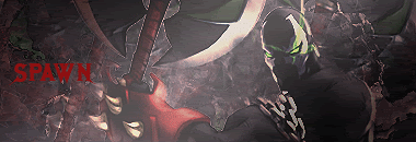
I rly like this one. Comments?
-
-
-
Pretty nice sig man good lighting and blending maybe just smudge or change opacity to the green splatter clipping mask in the bottom left and the opacity of the text so it doesn't draw as much attention away from the render :S but overall GJ man it looks pretty nice :P
Dan.
-
Not bad, but I think you've got too many different colors in there.
Don't think you need that purple.
As far as depth, I think it might help if you didn't blend his arm like that, but made it stand out more.
You blended in his lower 1/2, so I think it would look better to leave the arm alone and get some cool depth.
Just my thoughts though 
O yea, text needs alot of work too.
-
yeah u should've made his arm stand out a bit more cuz i'm assuming that's ur focal. since u have most of the effects around there. with a few minor adjustments this'll be a really nice sig.
-
Thanks for the comments guys.
Last edited by elixile; 08-07-2008 at 08:45 AM.
-
There is just too many colors. Everything looks great except for the coloring. Use some gradient maps, and photo filters to get the colors more closely related.
The blending looks pretty good. I think you should try to blurr the top right. Its kind of distracting and would add some nice depth to it.
Text needs work too, but it's pretty good.
 My DevART
RATCHET is my bitch
Andrew says:
u ever stolen a bible?
Apathy says:
no
used the last two pages to roll a joint though
Andrew says:
wow
thats fucking hard core
^^HAHAHA, dm sucks XD
Similar Threads
-
By XaiXo in forum Sigs & Manips
Replies: 4
Last Post: 08-07-2008, 09:03 AM
-
By Grumpylump in forum Digital Art
Replies: 8
Last Post: 01-09-2008, 03:24 PM
-
By narcosynthesis in forum Digital Art
Replies: 4
Last Post: 07-17-2005, 11:00 AM
-
By Kelso in forum Sigs & Manips
Replies: 3
Last Post: 06-30-2005, 05:18 PM
 Posting Permissions
- You may not post new threads
- You may not post replies
- You may not post attachments
- You may not edit your posts
-
Forum Rules
|


 Reply With Quote