0 members and 442 guests
No Members online

» Site Navigation

» Stats
Members: 35,443
Threads: 103,072
Posts: 826,684
Top Poster: cc.RadillacVIII (7,429)
|
-
-

I don't like the text on this. Perhaps be more creative. Pretty nice sig.
-
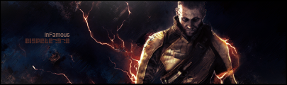
the lighting coming from underneath scorpion is a great effect, nice job. the c4d for the bg is not a good idea, try smudgin it around a bit and such for a better bg. and read up on a text tut for some ideas. this could be a solid sig with some minor improvements man, keep it up.
-
The text is good font wise. You want to stick with default fonts until you can get your grasp on text. It's just the color that is a problem. CHange the color to something like a red or orange coloring.
I agree with immortal it is not a good idea to use a c4d as a background at all.
However the lighting is pretty good. I think you should try using two lightsources on this sig however. On on the top left of his head and one where you have it below his gun spike thing..
Not bad though.
 My DevART
RATCHET is my bitch
Andrew says:
u ever stolen a bible?
Apathy says:
no
used the last two pages to roll a joint though
Andrew says:
wow
thats fucking hard core
^^HAHAHA, dm sucks XD
-
commented on playstation forums lol
-
font doesnt really go with the sig you should try diffrent colors that match the rest of the sig but besides that good job
Similar Threads
-
By jerry in forum Sigs & Manips
Replies: 5
Last Post: 10-17-2005, 04:01 PM
-
By imported_starcraft in forum Digital Art
Replies: 17
Last Post: 09-15-2005, 10:05 AM
-
By xProphet in forum Digital Art
Replies: 9
Last Post: 08-29-2005, 09:46 AM
-
By Wiseson in forum Digital Art
Replies: 5
Last Post: 07-21-2005, 03:20 AM
-
By graffic in forum Sigs & Manips
Replies: 7
Last Post: 02-11-2005, 11:37 PM
 Posting Permissions
- You may not post new threads
- You may not post replies
- You may not post attachments
- You may not edit your posts
-
Forum Rules
|


 Reply With Quote