0 members and 8,086 guests
No Members online

» Site Navigation

» Stats
Members: 35,443
Threads: 103,072
Posts: 826,684
Top Poster: cc.RadillacVIII (7,429)
|
-
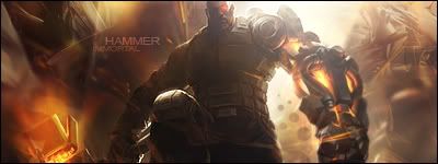
 Hammer Hammer
Damn I'm still feeling rusty, no ideas, no inspiration, i'm feeling like shit lol.
need that spark back...until then i'll keep trying.

wat u guys think i'm doing wrong?
-
I don't think you're necessarily doing anything wrong.
I think this looks pretty good, I like the lighting effects.
May try to work in a c4d or 2...
-
I Agree with stud but i feel the bottom of the render should be blended abit more and its abit dark :S but overall nice sig PM me if you want some ideas for sigs xD i have plenty 
Dan.
-
Brilliant lighting. Got it spot on imo.
Like the above comments, either try to add a C4D for some effects, or use the pen tool+ripple to jazz up the background.
Oh, great depth too.
   Religion gives nothing in life, only in death.
-
 Originally Posted by Studhorse

I don't think you're necessarily doing anything wrong.
I think this looks pretty good, I like the lighting effects.
May try to work in a c4d or 2...
thnx stud, yeah i guess i'll add in some more c4ds, cuz they're there just on screen and stuff.
Originally Posted by zole
I Agree with stud but i feel the bottom of the render should be blended abit more and its abit dark :S but overall nice sig PM me if you want some ideas for sigs xD i have plenty
Dan.
yeah i'll try to blend it in a bit then. thnx zole.
Originally Posted by XaiXo
Brilliant lighting. Got it spot on imo.
Like the above comments, either try to add a C4D for some effects, or use the pen tool+ripple to jazz up the background.
Oh, great depth too.
hmm penttool + ripple...i'll try mayube..i guess i'll fill up the background a bit, thnx alot xai.
-
S'alright Immortal. To be honest it doesn't need much, just something to bring the background to life a bit more. The lighting and depth are pretty much perfect, but the top left and the right seem a bit empty in comparison. 
Religion gives nothing in life, only in death.
-
Lighting is sick. And depth is great. You nailed the text as well.
I think you need to sharpen the render a bit IMO. You could try adding in a c4d or so. Maybe intertwine it around him. that could be hard though and i know it's not your forte'.
So try adding in a clipping mask or so, it might help. The coloring looks great, and again awesome job on the depth. good job.
 My DevART
RATCHET is my bitch
Andrew says:
u ever stolen a bible?
Apathy says:
no
used the last two pages to roll a joint though
Andrew says:
wow
thats fucking hard core
^^HAHAHA, dm sucks XD
-
thnx alot papa i'll get on it.
-
V2 any better?
-
CTRL+SHIFT-N
Image -> apply image
Filter ->sharpen->sharpen
that could make it look better but i onno

   ")     
 [((_CRAYOLA_((]>[((_CRAYOLA_((]>[((_CRAYOLA_((]>[((_CRAYOLA_((]>[((_CRAYOLA_((]>[((_CRAYOLA_((]>
Similar Threads
-
By Jk2 in forum Digital Art
Replies: 0
Last Post: 05-13-2006, 07:57 AM
 Posting Permissions
- You may not post new threads
- You may not post replies
- You may not post attachments
- You may not edit your posts
-
Forum Rules
|


 Reply With Quote


