0 members and 500 guests
No Members online

» Site Navigation

» Stats
Members: 35,443
Threads: 103,072
Posts: 826,684
Top Poster: cc.RadillacVIII (7,429)
|
-
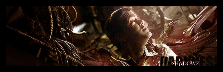
 Final Fantasy Final Fantasy
Just some sig I made when I was bored :].
C&C please :3!

-
Pretty cool, good blending there. My main dislike is the monotone colourings, I think the render should be a bit more coloured than the background. The text needs moving a bit, since half of it is obscured.
Good use of clipping mask by the way. 
   Religion gives nothing in life, only in death.
-
hihi thx will work on it later :]
-
I concur with XaiXo.
I effin' love the blending though, its delicious...if that makes sense o.O
Totally Final Fantasy though.
Great job.
-
Yea, great job witht he smudging and blending.
Colors are pretty cool too.
IMO though I think you could have left a little color in her face and you also blended both shoulders and arms and I think you could have left off her right (the left from your point of view)one to create some depth because I would say that's what's lacking right now...depth.
-
Thanks guys, I already edited my text a bit.
But the thing is with her right [left for us] shoulder is that the color is the same as the bg so it looks like it's blend in, which I probably did a little bit. So it's very hard to make that look different now because then i'll have to make the whole sig again lol :]. I'll make another one soon and remember your comment, thanks guys :3.
-
Blending is great. COloring needs work though. if you add a smidge (sp?) of yellow on the light source it will probabaly fix that a bit.
great effects and lighting! text placement needs work. try moving it over to the right side of the sig.
Good job overall.
 My DevART
RATCHET is my bitch
Andrew says:
u ever stolen a bible?
Apathy says:
no
used the last two pages to roll a joint though
Andrew says:
wow
thats fucking hard core
^^HAHAHA, dm sucks XD
-
sweet blending, just get rid of that overpowering purple IMO
-
The colors are a little too monotone. Experiment with gradient maps and different shades of the color for a better appealing effect. Nonetheless pretty ok job.
Similar Threads
-
By RONIN in forum Sigs & Manips
Replies: 6
Last Post: 10-22-2007, 09:22 PM
-
By Daemon in forum Sigs & Manips
Replies: 4
Last Post: 07-19-2007, 01:33 PM
-
By Infidel in forum Sigs & Manips
Replies: 13
Last Post: 08-11-2005, 09:29 AM
-
By --/insaneclown\-- in forum Sigs & Manips
Replies: 5
Last Post: 07-14-2005, 07:02 AM
-
By --/insaneclown\-- in forum Resources
Replies: 0
Last Post: 07-13-2005, 08:05 PM
 Posting Permissions
- You may not post new threads
- You may not post replies
- You may not post attachments
- You may not edit your posts
-
Forum Rules
|


 Reply With Quote