GFXVoid Graphic Design Forum

Remove Text Formatting
Loading...

» Online Users: 1,012

0 members and 1,012 guests
No Members online

» Site Navigation

 > FAQ

» Stats

Members: 35,443
Threads: 103,072
Posts: 826,684
Top Poster: cc.RadillacVIII (7,429)
Welcome to our newest member, Lekelindids
Results 1 to 5 of 5

Thread: 3 new sigs

  1. #1
    Join Date
    Apr 2008
    Posts
    208

    Default 3 new sigs


    Last edited by eagles16; 08-08-2008 at 03:40 PM.

  2. #2
    Join Date
    Aug 2008
    Posts
    9

    Default

    You got the tut for the 2nd and 3rd and the 3rd one in your sig from sigtutorials.com right?


  3. #3
    Join Date
    Apr 2008
    Posts
    208

    Default

    yeah the 2nd one it looked cool

    the third one i just played around after the second one

  4. #4
    Join Date
    Nov 2007
    Location
    South Wales
    Posts
    470

    Default

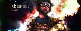
    The Spiderman one is cool, if you make it a bit smaller and add some lighting, that'll be one to current.

    The 2nd one is pretty minimalistic, but it's nicely done. However, you NEED to change the text, that font kills it to death.

    3rd one, pretty much the same, however I'd suggest blending the soldier a bit more, and even up the colours to fit better with the background.

    Religion gives nothing in life, only in death.

  5. #5
    Join Date
    Apr 2008
    Posts
    208

    Default

    thanks ill try and add some lighting on spidey

Posting Permissions

  • You may not post new threads
  • You may not post replies
  • You may not post attachments
  • You may not edit your posts
  •  
Powered by vBadvanced CMPS v4.1.1