0 members and 862 guests
No Members online

» Site Navigation

» Stats
Members: 35,443
Threads: 103,072
Posts: 826,684
Top Poster: cc.RadillacVIII (7,429)
|
-
 Army of Two Army of Two
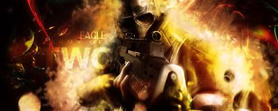
followed firescorpio's tut
Last edited by eagles16; 08-10-2008 at 03:08 PM.
-
Oh.
really nice dude. ;]
maybe TWO is too big, but sig lloks really nice.
missing border only
-
-
-
-
yeah the army of two text is the actual logo i just resized it and lightened it
-
the bubble c4d on the left is distracting and just generally doesn't go well.
-
 Originally Posted by ratchetnclank

the bubble c4d on the left is distracting and just generally doesn't go well.
agreed, otherwise a very solid sig.
-
Agree with the above. Everything looks pretty nice except for the bubble. Also the Two in the army of two text is a bit too big for my liking but aside from that it's solid. GJ
 My DevART
RATCHET is my bitch
Andrew says:
u ever stolen a bible?
Apathy says:
no
used the last two pages to roll a joint though
Andrew says:
wow
thats fucking hard core
^^HAHAHA, dm sucks XD
-
thanks guys, the reason why it's a bubble c4d is because i couldn't find an explosion one
Similar Threads
-
By Church© in forum Sigs & Manips
Replies: 2
Last Post: 07-15-2008, 05:09 PM
-
By PetroToreno in forum Sigs & Manips
Replies: 2
Last Post: 03-21-2007, 07:46 AM
-
By PatDaniels in forum Sigs & Manips
Replies: 2
Last Post: 03-02-2007, 06:23 AM
-
By Ravon in forum Sigs & Manips
Replies: 2
Last Post: 08-26-2006, 11:57 PM
-
By Octavius in forum Sigs & Manips
Replies: 0
Last Post: 10-11-2005, 12:40 AM
 Posting Permissions
- You may not post new threads
- You may not post replies
- You may not post attachments
- You may not edit your posts
-
Forum Rules
|


 Reply With Quote


