0 members and 3,652 guests
No Members online

» Site Navigation

» Stats
Members: 35,443
Threads: 103,072
Posts: 826,684
Top Poster: cc.RadillacVIII (7,429)
|
-
 2 new sigs CnC 2 new sigs CnC
CnC
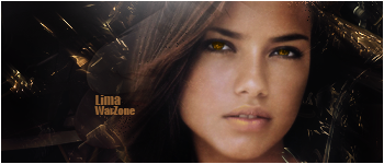
Darkness beauty
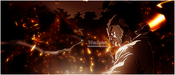
Abstract Afro
-
The first one looks a little bit plain to me, But I like it. Simplicity is art imo, The second one I like the shine effect but his sleeve may just be a tad to bright, and the text could use better blending.
-
2nd looks really awesome.
amazing ;]
but text really need other placament
-
yah dude, u killed it on the second one.
it looks like a burning forest.
just change the text up a bit
and bam u'll have a class sig.
as for the first one, a bit plain.
u gotta remember ur sig has to have a theme.
and since its that girl, i think you should've thrown some colour in there i guess.
but good work. can't wait to see more.
-
They look great, but on the second one, the render doesn't really blend in with the background. Maybe some more flow? But they both do look great!
-
 Originally Posted by Immortal.

yah dude, u killed it on the second one.
it looks like a burning forest.
just change the text up a bit
and bam u'll have a class sig.
as for the first one, a bit plain.
u gotta remember ur sig has to have a theme.
and since its that girl, i think you should've thrown some colour in there i guess.
but good work. can't wait to see more.
i added color to her eye to match the C4D i put in the background
-
Yea, that color stands out too much,it doesn't look very natural.
-
nice. the first one is plain i agree and second ic cool :P.
and btw really likeyou gorillaz sig
-
 Posting Permissions
- You may not post new threads
- You may not post replies
- You may not post attachments
- You may not edit your posts
-
Forum Rules
|


 Reply With Quote