0 members and 7,646 guests
No Members online

» Site Navigation

» Stats
Members: 35,443
Threads: 103,072
Posts: 826,684
Top Poster: cc.RadillacVIII (7,429)
|
-
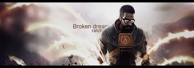
 Broken dreams. Broken dreams.
V1:
V2:

If anyone says it's like my infamous one i'm gonna punch them xD
-
v1 is best,pretty atmosphere ;-)
Favourite

-
loving v2 its wayy more contrasted.
i like it that way.
nice job with the effects on this ratchet.
-
V2. V1 needs contrast and really needs work.
The Bg on this lack flow and depth. It seems really flat to me. The effects are okay but i'd rly like to see something else soon.
the text is nice. But it needs more Blending. I can see most of his edges pretty easily.
Finally i think it's kind of emtpy. I want to see more going on, right now it's kind of minimalistic.
Not bad though.
 My DevART
RATCHET is my bitch
Andrew says:
u ever stolen a bible?
Apathy says:
no
used the last two pages to roll a joint though
Andrew says:
wow
thats fucking hard core
^^HAHAHA, dm sucks XD
-
V2 best one. V1 is to gray and lacks depth. Also I think u could make the stock bigger so the focal would be also. Nice sig though.
-
V2.
papa said a lot.
and its not like your infamous. 
awesome effects.
plus. I dont like some places with ripple. just dont the opacity of some. IMO
-
Looks like your Infamous one.
-
 Originally Posted by Studhorse

Looks like your Infamous one.
/slaps stud
-
Lol 
-
I like it, I think the render fits nicely with the "Broken dreams" thing, I like the wireframe around him aswell.
but yeh, as said, not too much going on. still pretty solid imo.
These machines feed off the tears, of broken lives and dying dreams. - Rise against.
Similar Threads
-
By BustA in forum Digital Art
Replies: 6
Last Post: 01-08-2006, 04:38 AM
-
By BustA in forum Digital Art
Replies: 5
Last Post: 12-01-2005, 08:23 AM
-
By arson in forum Digital Art
Replies: 6
Last Post: 09-05-2005, 08:02 AM
-
By Pleymo in forum Sigs & Manips
Replies: 8
Last Post: 03-26-2005, 10:36 AM
-
By tacoX in forum The Void
Replies: 7
Last Post: 03-17-2005, 09:46 PM
 Posting Permissions
- You may not post new threads
- You may not post replies
- You may not post attachments
- You may not edit your posts
-
Forum Rules
|


 Reply With Quote


