GFXVoid Graphic Design Forum

Remove Text Formatting
Loading...

» Online Users: 2,585

0 members and 2,585 guests
No Members online

» Site Navigation

 > FAQ

» Stats

Members: 35,443
Threads: 103,072
Posts: 826,684
Top Poster: cc.RadillacVIII (7,429)
Welcome to our newest member, Lekelindids
Results 1 to 3 of 3

Thread: AirGear

  1. #1
    Join Date
    Aug 2008
    Posts
    9

    Default AirGear


    eh CnC please

  2. #2
    Join Date
    Jun 2008
    Location
    B-Town, IN
    Posts
    320

    Default

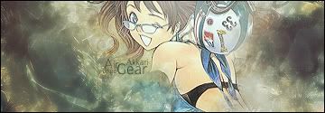
    I like the color choices, but i feel like they could be even bolder still. the smudging of the background is well done, but IMO doesn't hold enough color to match the cartoony nature of the render. I like your text, but maybe move it to the left a little. I like the right side of the sig, especially immediately along the render's edge. keep it up!


    "You want a piece of Uncle?" - Uncle, Jackie Chan Adventures

  3. #3
    Join Date
    Jul 2007
    Location
    Lithuania
    Posts
    3,611

    Default

    where is the hand?
    i miss it :///
    maybe some more blendng is needed.
    text is nice too.
    and like aces said, I like the BG too. good choise. IMO


Posting Permissions

  • You may not post new threads
  • You may not post replies
  • You may not post attachments
  • You may not edit your posts
  •  
Powered by vBadvanced CMPS v4.1.1