GFXVoid Graphic Design Forum

Remove Text Formatting
Loading...

» Online Users: 5,924

0 members and 5,924 guests
No Members online

» Site Navigation

 > FAQ

» Stats

Members: 35,443
Threads: 103,072
Posts: 826,684
Top Poster: cc.RadillacVIII (7,429)
Welcome to our newest member, Lekelindids
Results 1 to 6 of 6

Thread: New sig...

  1. #1
    Join Date
    Aug 2008
    Posts
    8

    Default New sig...

    Well meh is the word that comes in mind.

    Last edited by Saby; 08-31-2008 at 10:34 AM.

  2. #2
    Join Date
    Jul 2007
    Location
    Lithuania
    Posts
    3,611

    Default

    Am.
    I think ou oversharpened it.
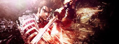
    really.
    some places have nice blending.
    and add a border.
    for the text I suggest to use simple fonts. like arial tahoma etc.


  3. #3
    Join Date
    Jul 2008
    Posts
    38

    Default

    Agreed it looks way over sharpened.

  4. #4
    Join Date
    Mar 2007
    Location
    Northport, AL USA
    Posts
    264

    Default

    agreed. Its too bad about the oversharpened spots, cuz the sig itself seems put together well. Dont really like the coloring method either, personally. Too, dunno...bright, or something.

  5. #5
    Join Date
    Jan 2007
    Location
    Minnesota
    Posts
    5,091

    Default

    Some of it is oversharpened. Specifically that kind of bright brown spot to the right of the render. The blending on this is cool and you did well with the lighting. good job, keep up the work.


    My DevART
    RATCHET is my bitch
    Andrew says:
    u ever stolen a bible?
    Apathy says:
    no
    used the last two pages to roll a joint though
    Andrew says:
    wow
    thats fucking hard core
    ^^HAHAHA, dm sucks XD


  6. #6
    Join Date
    Aug 2008
    Posts
    8

    Default

    Thx for the tips

Posting Permissions

  • You may not post new threads
  • You may not post replies
  • You may not post attachments
  • You may not edit your posts
  •  
Powered by vBadvanced CMPS v4.1.1