0 members and 843 guests
No Members online

» Site Navigation

» Stats
Members: 35,443
Threads: 103,072
Posts: 826,684
Top Poster: cc.RadillacVIII (7,429)
|
-
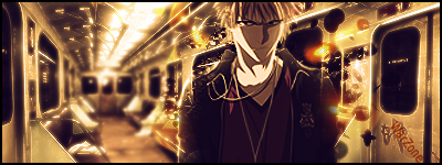
 Ichigo Tag Ichigo Tag
CnC Please
-
effects are nice.
but I think sig is too bright., I mean BG
that that the focal is too dark.
-
I like this good work.
Not to shure on the text tho placement could be a bit better.
I like the depth of this tag a lot.
-
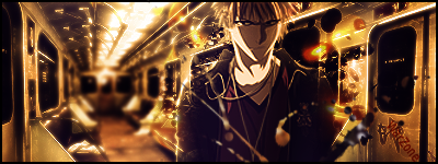
V2 added some clipping masks and some extra depth
-
nah i like v1 much better
i like the change in lighting
gives a dark feel to ichigo
nice mood and feel to it
plus i think the splatter/clipping mask in v2 are too much in areas ^_^
but yes work on text placement
try to make it look more like graffete on the wall
(spell check*)
nice work though
0.o and can you paste the link to that bg
-
nice 1 dude
there's a good flow and depth
Keep it up
WHAT'S THIS?! A SIGNATURE?
-
This is very cool. I like everything about it. trhe idea is perfect as well. Nice hidden text too, next time try a stroke-outline on your text, it will make it look more like graffitti.
I think you should darken the back of the train car. RIght now it's way too bright and really draws my eye to the center of the sig away from the render.
IMO you should just paint a bit of black on it or something. Overall though it's pretty nice.
 My DevART
RATCHET is my bitch
Andrew says:
u ever stolen a bible?
Apathy says:
no
used the last two pages to roll a joint though
Andrew says:
wow
thats fucking hard core
^^HAHAHA, dm sucks XD
-
 Originally Posted by john316

nah i like v1 much better
i like the change in lighting
gives a dark feel to ichigo
nice mood and feel to it
plus i think the splatter/clipping mask in v2 are too much in areas ^_^
but yes work on text placement
try to make it look more like graffete on the wall
(spell check*)
nice work though
0.o and can you paste the link to that bg
here ya go
http://s301.photobucket.com/albums/n...Graphic_16.jpg
-
wow your best yet IMO
u should darken up the train a bit IMO, a bit too dark.
but that idea and everything is great.
a few touches and it'll be great.
-
wow nice man I like very nice ^^ i like the way you blured out the bottom half of the sub to make ichi stnd out more ^^
Similar Threads
-
By BeaSt in forum Digital Art
Replies: 5
Last Post: 09-11-2007, 07:45 PM
-
By +mw.kira in forum Sigs & Manips
Replies: 4
Last Post: 09-02-2007, 05:12 AM
-
By BeaSt in forum Sigs & Manips
Replies: 4
Last Post: 05-26-2007, 09:42 AM
-
By Sobek in forum Digital Art
Replies: 7
Last Post: 08-28-2006, 03:41 AM
-
By imported_dafatman in forum Sigs & Manips
Replies: 2
Last Post: 04-24-2006, 04:54 PM
 Posting Permissions
- You may not post new threads
- You may not post replies
- You may not post attachments
- You may not edit your posts
-
Forum Rules
|


 Reply With Quote


