GFXVoid Graphic Design Forum

Remove Text Formatting
Loading...

» Online Users: 258

0 members and 258 guests
No Members online

» Site Navigation

 > FAQ

» Stats

Members: 35,443
Threads: 103,072
Posts: 826,684
Top Poster: cc.RadillacVIII (7,429)
Welcome to our newest member, Lekelindids
Results 1 to 9 of 9

Thread: Burnquist.

  1. #1
    Join Date
    Jul 2008
    Location
    Leominster, Massachusettes
    Posts
    2,293

    Default Burnquist.

    I changed it up a bit.


  2. #2
    Join Date
    Feb 2008
    Location
    Toronto, Canada
    Posts
    4,831

    Default

    v1 ftw.
    the colours on that one are nice.
    the flow off to the sides is well done too.
    keep it comin my boy.


  3. #3
    Join Date
    Sep 2008
    Posts
    1,589

    Default

    V1 is prety cool like your effects gimme some sparks of the trucks and I think you have got a winner.

  4. #4
    Join Date
    Jul 2008
    Location
    Leominster, Massachusettes
    Posts
    2,293

    Default

    The trucks are not all that visible.

  5. #5
    Join Date
    Jul 2008
    Location
    Vancity, Canada
    Posts
    2,985

    Default

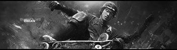
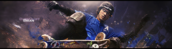
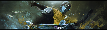
    I think this has been said before, but it looks like your other sigs. Don't get me wrong, it looks great, but you are using the same type of flow, and style with your sigs. They are great but maybe you should put your obvious talent into other styles instead of playing it safe with the same one. And the colours in the first one just make it a win, I don't like the blue face, and the black and white doesn't fit but the blue shirt looks amazingly blue, I love that. :P
    Quote Originally Posted by MarkPancake View Post
    MarkPancake banned.
    Success.

  6. #6
    Join Date
    Jul 2008
    Location
    Manchester, England
    Posts
    929

    Default

    As we all said change your style man im getting sick of looking at from a distance could be the same as your last sig... its annoys me lol xD V1 or V3 is better dno which lol but chance up your style and deffo dont use the same text in the last 3 sigs.. vary it up abit.


  7. #7
    Join Date
    Sep 2008
    Location
    England
    Posts
    202

    Default

    Well I suppose its good that there is a distinctive style. However, It is nice to vary it as well. Go for something wacky and orginal next time.
    Latest:


  8. #8
    Join Date
    Jul 2008
    Location
    Leominster, Massachusettes
    Posts
    2,293

    Default

    I'm slowly changing things up a little bit.

  9. #9
    Join Date
    Jan 2008
    Location
    Cali
    Posts
    523

    Default

    I like the black and white 1 personally. Then i would say go with the v1 after that. But in this sig black and white is better imo.

    SUN-KEN-ROCK


    http://jayteare.deviantart.com/

    Cosmosys
    Intrinsic Nature will be back soon no worries.
    Gifts

Posting Permissions

  • You may not post new threads
  • You may not post replies
  • You may not post attachments
  • You may not edit your posts
  •  
Powered by vBadvanced CMPS v4.1.1