0 members and 4,691 guests
No Members online

» Site Navigation

» Stats
Members: 35,443
Threads: 103,072
Posts: 826,684
Top Poster: cc.RadillacVIII (7,429)
|
-
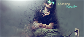
 Escaping Reality Escaping Reality
um well this was my first SOTW entry q__q
i think its my best work with a stock img x]
CnC plze o-o
Escaping Reality
Latest

-
-
-
-
it looks nice.
but the emptiness can represent something...but it doesn't rlly flow with the sig?
solid sig tho.
-
I like it very much.. I also think the hands are bit to blended.. I would use burn tool at the empty spaces and dodge the light abit more
~Joodi~
-
THis is a toughs tock to work with. I think You should try smudging the BG or something. That way it doesn't feel soo empty but it also leaves it empty enough, where it doesn't distract away from the kid.
The text is pretty good, and the effects are pretty nice. I think you did good on this one.
 My DevART
RATCHET is my bitch
Andrew says:
u ever stolen a bible?
Apathy says:
no
used the last two pages to roll a joint though
Andrew says:
wow
thats fucking hard core
^^HAHAHA, dm sucks XD
-
thnx n__n
ill try to work on the bg later q__q hope i can still modified my post with the sig o-o
Latest
Similar Threads
-
By Sugz in forum Digital Art
Replies: 7
Last Post: 01-20-2008, 04:42 AM
-
By pearlized in forum Digital Art
Replies: 4
Last Post: 05-18-2007, 09:32 PM
-
By Ravon in forum Sigs & Manips
Replies: 0
Last Post: 02-22-2006, 08:32 AM
-
By BustA in forum Digital Art
Replies: 18
Last Post: 10-28-2005, 08:44 AM
-
By Decabras in forum Digital Art
Replies: 7
Last Post: 08-04-2005, 05:03 PM
 Posting Permissions
- You may not post new threads
- You may not post replies
- You may not post attachments
- You may not edit your posts
-
Forum Rules
|


 Reply With Quote