0 members and 6,038 guests
No Members online

» Site Navigation

» Stats

Members: 35,443
Threads: 103,072
Posts: 826,684
Top Poster: cc.RadillacVIII (7,429)
|
-
 Deathnote Deathnote
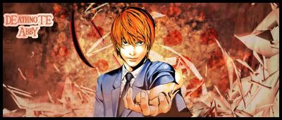
well i made this deathnote sig for my friend...hit me with some CnC plzz

-

hmmm...its a good sig.
i dont think u should've faded out the c4d, it sorta lessens the impact.
the render could use some blending.
but ur bg is nicely done.
u could change up the text a bit, but it looks ok rite now.
try not to place text in corners.
-

omg thats actually the most helpful comment i have gotten in my entire life. finally a forum with intelligent people. Thanks for ur help ill try another one and see if its ny better.
-

Text-wise, i think you need to get rid of that enourmous stroke haha. usually you want your text to blend it. It's kind of like when you are matching clothes together. You put on some jeans, which is the lighting. An american eagle shirt, which is the focal or render, and then you put on your shoes. You want it to match but you don't really want them to stand out that much. The shoes are the text in this case. (analogies ftw!)
Try to stick to default fonts, they tend to blend better and look better than 99% of fonts you can download.
The BG is okay, but the smudging seems a bit rushed. Get a chalk brush at 36 pixels and add some scattering to it then smudge. I think you will get a result you like much more. If you don't like the chalk brush Pato92's smudge brushes give me great results too.
I like how you put the smudging overtop of the render, but it looks really translucent and doesn't make for very good blending at all. NExt time if it works beter for you overlap a c4d, or smudge more overtop of him or my personal favorite, add splatter clipping masks over the edges of him.
like immortal said the lowered opacity on the c4d doens't look right. Next time change the color and erase parts you don't like, don't just lower the opacity, it looks sloppy and rushed.
Not bad, i suggets you follow some tuts, especailyl my text tutorial i think you will benifit from it a lot.
 My DevART
RATCHET is my bitch
Andrew says:
u ever stolen a bible?
Apathy says:
no
used the last two pages to roll a joint though
Andrew says:
wow
thats fucking hard core
^^HAHAHA, dm sucks XD
-

the whole thing was a bit rushed and i couldnt be bothered finding my good smudging brush so i actually used a splatter brush to smudge and also yeah text tutorial will come in handy coz im horrible with text... also i didnt really know how do blend the render in maybs i shouldve just smudged him a bit.
Similar Threads
-
By FrasbR in forum Sigs & Manips
Replies: 8
Last Post: 07-15-2008, 09:56 AM
 Posting Permissions
- You may not post new threads
- You may not post replies
- You may not post attachments
- You may not edit your posts
-
Forum Rules
|


