0 members and 516 guests
No Members online

» Site Navigation

» Stats
Members: 35,443
Threads: 103,072
Posts: 826,684
Top Poster: cc.RadillacVIII (7,429)
|
-
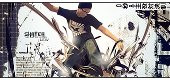
 Skater Skater
Last edited by Lew; 10-08-2008 at 07:03 PM.
-
My first impression, is this is really chaotic. it's okay but there is stuff everywhere. Try and minimalize stuff around the edges it makes it really hard for the eye to focus.
Not bad otherwise. i like the text.
 My DevART
RATCHET is my bitch
Andrew says:
u ever stolen a bible?
Apathy says:
no
used the last two pages to roll a joint though
Andrew says:
wow
thats fucking hard core
^^HAHAHA, dm sucks XD
-
As Papa said the stuff on the side ruins it. All the C4D work though is awesome.
-
Thats kewl 
-
I agree with Papa, If you got rid of the Stuff on the side, It'll make it a bit better, but overall, 7/10
My New Sig 
Time is The Enemy.
-
Loving the text and lighting work nice.
Similar Threads
-
By stanx in forum Sigs & Manips
Replies: 4
Last Post: 01-23-2007, 07:17 AM
-
By tacoX in forum The Void
Replies: 38
Last Post: 06-30-2006, 11:08 PM
-
By Heron in forum Member Battles Voting
Replies: 20
Last Post: 08-30-2005, 03:45 PM
-
By Heron in forum Sigs & Manips
Replies: 9
Last Post: 08-09-2005, 03:00 AM
 Posting Permissions
- You may not post new threads
- You may not post replies
- You may not post attachments
- You may not edit your posts
-
Forum Rules
|


 Reply With Quote


