GFXVoid Graphic Design Forum

Remove Text Formatting
Loading...

» Online Users: 4,177

0 members and 4,177 guests
No Members online

» Site Navigation

 > FAQ

» Stats

Members: 35,443
Threads: 103,072
Posts: 826,684
Top Poster: cc.RadillacVIII (7,429)
Welcome to our newest member, Lekelindids
Results 1 to 8 of 8
  1. #1
    Join Date
    Sep 2008
    Location
    Near my PC..Lol.
    Posts
    454

    Talking Gael monfils....


    CnC........


    Go GFX viod!

  2. #2
    Join Date
    Jul 2007
    Location
    Lithuania
    Posts
    3,611

    Default

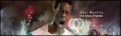
    awesome one.
    text is a bit over.
    attract too much attention.
    also I think those two rings is too much focal.
    other than that. awesome work there.


  3. #3

    Default

    Its really good except for the render. the render is lq.

  4. #4
    Join Date
    Oct 2007
    Posts
    2,782

    Default

    Looks like a zombie.


  5. #5

    Default

    damn 0.o how ugly that guy is the rings are to much vocal ..
    but the flow is nice ..
    ...:newest:...

  6. #6
    Join Date
    Sep 2008
    Location
    Near my PC..Lol.
    Posts
    454

    Default

    Maybe lower the opactiy of The text?./...And the rings?


    Go GFX viod!

  7. #7
    Join Date
    Sep 2008
    Posts
    1,589

    Default

    Great work here on effects lower the text opency to 90% and its done good work.

  8. #8
    Join Date
    Sep 2008
    Posts
    7

    Default

    AHHHHHHHHHHHH! ZOMBIE! LOL

Posting Permissions

  • You may not post new threads
  • You may not post replies
  • You may not post attachments
  • You may not edit your posts
  •  
Powered by vBadvanced CMPS v4.1.1