0 members and 1,431 guests
No Members online

» Site Navigation

» Stats
Members: 35,443
Threads: 103,072
Posts: 826,684
Top Poster: cc.RadillacVIII (7,429)
|
-
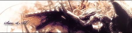
 Two :o Two :o
I just made this, I was really bored. I don't really like it myself, but tell me what ya think >.<
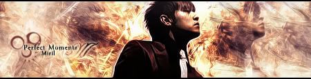
This is the other one... made it yesterday. I got about two steps through Papa's "Music Tut" and realized it wasn't working out and continued to make this with generally the same style ;o I also did Papa's little text style with the cursive in the background  I like that style Papa I like that style Papa

(without topaz)
(with topaz)
C&C Please!

Et Tu?
SilentShadow | Jorrne | Arcmenis | Garis | Splinter | Sanbu | DeadlesS | Tekken | Proflax | Suddu
-
-
Ahh very cool outcome. I like it that you experimented and went your own way, you'll never learn if you just follow a tut the entire time. Seriously though you did good work, a few crits however:
Ease up on the purple/orange gradient map. it's a fantastic gradient, as it gives so much cool color, but it's a bit of a whored style and you want to use it sparingly.
The text is nice on both sigs, however watch out for the blending options! Stray away from them, they make your text stick out and not blend with the sig at all.
You did a pretty good job on the blending, though the top sig is a bit bright. I reccomend sharpening the render a tad too to bring it out a bit more.
2nd is much better. The BG is nice and the lightign isn't as strong. pretty good text though the font is a bti shifty, and i gotta say im not to big a fan of the circles. Finally there seems to be a ring around the render, try and reduce that white ring so the render can blend better.
Overall pretty nice, it seems you took some nice things from my tutorial.
 My DevART
RATCHET is my bitch
Andrew says:
u ever stolen a bible?
Apathy says:
no
used the last two pages to roll a joint though
Andrew says:
wow
thats fucking hard core
^^HAHAHA, dm sucks XD
-
Link to the RenderSS please?

Go GFX viod!
-
About the white ring around the render in the second one, it was originally a stock, that was the part about the first few steps of your tut xD but then I had to erase the background to let the c4d's come out a little more, I can't say I'm good at rendering at all (I should work on that actually...) so I just kind of erased it, when I noticed the line nearing the end of making the sig I couldn't really fix it easily.  sorry sorry
Links to the render of the first and stock of the second::
Render: http://i299.photobucket.com/albums/m...ff/Dragon2.png
Stock: http://i299.photobucket.com/albums/m...ockpack472.jpg
Et Tu?
SilentShadow | Jorrne | Arcmenis | Garis | Splinter | Sanbu | DeadlesS | Tekken | Proflax | Suddu
-
 Posting Permissions
- You may not post new threads
- You may not post replies
- You may not post attachments
- You may not edit your posts
-
Forum Rules
|


 Reply With Quote
