GFXVoid Graphic Design Forum

Remove Text Formatting
Loading...

» Online Users: 2,167

0 members and 2,167 guests
No Members online

» Site Navigation

 > FAQ

» Stats

Members: 35,443
Threads: 103,072
Posts: 826,684
Top Poster: cc.RadillacVIII (7,429)
Welcome to our newest member, Lekelindids
Results 1 to 5 of 5

Thread: Scorpion

  1. #1
    Join Date
    May 2007
    Posts
    71

    Default Scorpion

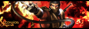
    I'm quite happy with My result's on this one so tell me what you think, ratings / CC MUCH appreciated - seriously.

    I Really love this turn out -.-
    I VERY VERY 'loosely' followed "Garis's?" sorry lol, The spiderman tutorial with scorpion instead ^.^

    Newest:

    Favorite:


  2. #2
    Join Date
    Jan 2008
    Location
    Cali
    Posts
    523

    Default

    hmm colors seem a bit off, over-contrasted.But it's a good sigoverall. Just work more on those

    SUN-KEN-ROCK


    http://jayteare.deviantart.com/

    Cosmosys
    Intrinsic Nature will be back soon no worries.
    Gifts

  3. #3
    Join Date
    May 2007
    Posts
    71

    Default

    Yeah i was hiding and showing over 7 layers in different combination some were way to bright and others way to dark once i removed some it went like this, I was attempting to keep the contrast the same from left - which, succeeded yet scorpion looks terrible :P I still however like the background in it I also find now that re-looking at it, scorpion is all blurry ah well, will slap another up on tuesday[or so] using stocks c4ds and a render, just don't know what yet, Since I've never worked with clipping mask's I guess I'll throw a few of those in two.
    Newest:

    Favorite:


  4. #4
    Join Date
    Aug 2008
    Location
    Bustin Windows
    Posts
    187

    Default

    The colors just don't go with the sig what so ever. Use the little color extracting tool and extract 2 prominent colors from the render/stock and put a gradient map over it put it on soft light and play around with opacity.
    FAV

    NEW


  5. #5
    Join Date
    May 2007
    Posts
    71

    Default

    I did use colors from the sig ^_^ like i said it had to do with the gradient maps and overlays i was doing in it. *coughs* i used "Luminosity/Color - forget which" - which screwed the sig i think, i can remove the blending and repost it syill have the psd on my comp ^_^ maybe I'm wrong but I'm so sure i used Yellow and Orange straight from the render and it came out like that xD

    Edit: heh, I lied.
    Last edited by Grogerian; 11-04-2008 at 08:02 AM.
    Newest:

    Favorite:


Similar Threads

  1. scorpion
    By Falcata in forum Digital Art
    Replies: 3
    Last Post: 12-18-2005, 11:18 AM
  2. Scorpion
    By jerry in forum Sigs & Manips
    Replies: 5
    Last Post: 10-17-2005, 04:01 PM
  3. scorpion
    By imported_starcraft in forum Digital Art
    Replies: 17
    Last Post: 09-15-2005, 10:05 AM
  4. Scorpion
    By xProphet in forum Digital Art
    Replies: 9
    Last Post: 08-29-2005, 09:46 AM
  5. Scorpion sig
    By graffic in forum Sigs & Manips
    Replies: 7
    Last Post: 02-11-2005, 11:37 PM

Posting Permissions

  • You may not post new threads
  • You may not post replies
  • You may not post attachments
  • You may not edit your posts
  •  
Powered by vBadvanced CMPS v4.1.1