0 members and 397 guests
No Members online

» Site Navigation

» Stats
Members: 35,443
Threads: 103,072
Posts: 826,684
Top Poster: cc.RadillacVIII (7,429)
|
-
-

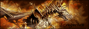
This isn't bad.
first things first, i realize you used a default font, but when i say default font i mean default looking; arial, garamound, tahoma. haha next time i reccomend one of those.
The blending at the top isn't bad but i'd liek to see some overlapping ontop of the gun, or something it just seems out of place not being blended.
The smudging isn't bad but you smudged it too much. You need to smudge with a small brush and vary it every time to give it lots of detail and changes.
 My DevART
RATCHET is my bitch
Andrew says:
u ever stolen a bible?
Apathy says:
no
used the last two pages to roll a joint though
Andrew says:
wow
thats fucking hard core
^^HAHAHA, dm sucks XD
Similar Threads
-
By Black Q in forum Sigs & Manips
Replies: 1
Last Post: 04-07-2008, 04:50 AM
-
By Twan in forum Sigs & Manips
Replies: 6
Last Post: 09-07-2005, 10:02 AM
-
By gunz in forum Sigs & Manips
Replies: 8
Last Post: 08-29-2005, 02:33 PM
-
By Dreiko Shadrack in forum Sigs & Manips
Replies: 1
Last Post: 06-23-2005, 07:47 PM
 Posting Permissions
- You may not post new threads
- You may not post replies
- You may not post attachments
- You may not edit your posts
-
Forum Rules
|


 Reply With Quote

