0 members and 6,004 guests
No Members online

» Site Navigation

» Stats

Members: 35,443
Threads: 103,072
Posts: 826,684
Top Poster: cc.RadillacVIII (7,429)
|
-
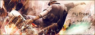
 Crysis Sig (I don't know what I did here) Crysis Sig (I don't know what I did here)

I don't know about this or how I even did it. It looks good and bad at the same time. I have no clue why it didn't turn into a steaming pile of you-know-what. Could I get some CnC on this to fix it? I think this could still be a cool sig!

"Judge a man by his questions,
not his answers."
-Voltaire
-

Too busy IMO. Smudge a bit.
-

Lol, the whole background is smudged bro, it's my render's chest and gun.

"Judge a man by his questions,
not his answers."
-Voltaire
-

I'm not sure if it would help, but maybe decreasing contrast on the guy himself and/or decreasing opacity/brightness on the background directly behind him a lil bit? It just seems like the eye is drawn away from the render... or something like that... I'm not sure... Like its a tad difficult to differentiate between the guy's arms and the faded background behind him. Besides that it seems like a really good sig. 
-

I see what you mean about the arms thing, I'll try and fix that up tomorrow. 

"Judge a man by his questions,
not his answers."
-Voltaire
-

Too sharpened..I mean the render .It kills it IMo,de sharpen it and its cool!
Go GFX viod!
-

i think the over brighness of the bg AND the render doesn't bring them both together well...
de contrast a bit, and erase over the layer mask a little..that might give you some better results.
-

Thanks immortal, I'll do that and blur it a tiny bit in a couple hours, swamped in work atm.

"Judge a man by his questions,
not his answers."
-Voltaire
Similar Threads
-
By cC.Midway in forum Sigs & Manips
Replies: 2
Last Post: 10-14-2008, 06:15 AM
-
By AnseM2k in forum Sigs & Manips
Replies: 9
Last Post: 10-01-2008, 03:48 AM
-
By flatty in forum Sigs & Manips
Replies: 4
Last Post: 09-18-2008, 06:44 PM
-
By ratchetnclank in forum Sigs & Manips
Replies: 8
Last Post: 09-17-2008, 03:20 PM
-
By Quoenusz in forum Digital Art
Replies: 3
Last Post: 12-21-2006, 12:39 PM
 Posting Permissions
- You may not post new threads
- You may not post replies
- You may not post attachments
- You may not edit your posts
-
Forum Rules
|

