0 members and 1,746 guests
No Members online

» Site Navigation

» Stats
Members: 35,443
Threads: 103,072
Posts: 826,684
Top Poster: cc.RadillacVIII (7,429)
|
-
 Prepare for War Prepare for War
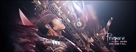
watchu guys think?
-
The light source on the gun is to bright, but other then that, It's nice. render has a lot of detail.
-
Very nice and like the style of the text.
-
Not fussy on the text, but it's my favourite by you. Lush.
...Tut? 
   Religion gives nothing in life, only in death.
-
Light source is a bit bright. Not really diggin' the giant "prepare" compared to the smaller text.

"Judge a man by his questions,
not his answers."
-Voltaire
-
I think the bright light suits it. Plus, it adds to the chainsaw sparks.
Religion gives nothing in life, only in death.
-
I feel this sig.
It's clean, HD and i like the light source, it's different and brings it upfront, maybe work on your blending a bit more Immy. It's a good sig overall, good job on it.
-
That is a pretty awesome sig, one of my favourite out of all yours. As said before, the light is a bit big, and your text could be improved but I really like how it looks so natural. Great job.
 Originally Posted by MarkPancake

MarkPancake banned.
Success.
-
i like it i just wish it had like a BG :S e.g. a battlefield because that could take some of that BLACK away :S
Edit: i also feel that the C4D on the right of the render ruins the flow because it is pointing the other way :S
-
thank you all i'll look into it
Similar Threads
-
By flatty in forum Sigs & Manips
Replies: 4
Last Post: 10-23-2008, 03:00 PM
-
By Blitz in forum Sigs & Manips
Replies: 4
Last Post: 04-04-2007, 12:49 PM
-
By Aesahaettr in forum Digital Art
Replies: 4
Last Post: 03-20-2007, 11:58 AM
 Posting Permissions
- You may not post new threads
- You may not post replies
- You may not post attachments
- You may not edit your posts
-
Forum Rules
|


 Reply With Quote


