0 members and 403 guests
No Members online

» Site Navigation

» Stats
Members: 35,443
Threads: 103,072
Posts: 826,684
Top Poster: cc.RadillacVIII (7,429)
|
-

 Originally Posted by CTX Sterling

Great tut!
Ive followed loads on this site, but this one inspired me to sign up and post my outcome.
Used a couple of different ideas from the tut, like the two clipping masks on the left, bringing a bit of life to a boring area.
What do you think?
Yours looks sweet :P i dont know much but i personally would have done something with the black area on the right, thats just me  Other then that it looks awesome, just a quick question... where did you get that font at? Other then that it looks awesome, just a quick question... where did you get that font at?
-
Originally Posted by DeathByBlood
Yours looks sweet :P i dont know much but i personally would have done something with the black area on the right, thats just me Other then that it looks awesome, just a quick question... where did you get that font at?
I used the font suggested,as i liked it so much. just searched for it on www.dafont.com
great site.
-
Originally Posted by DeathByBlood
Well, im total newb to photoshop, so i did my best with this but used a bad render for it -.- i dont have all the tools im supposed to but w/e
Result:

Crappy =/
nice try man...we learn from everything we do. keep at it and you'll get better slowly.
ur render is a bit off to the side and that usually doesn't work
try making ur text a bit smaller and basic fonts if you want it to standout.
keep it up
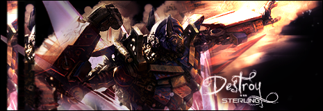
Originally Posted by CTX Sterling
Great tut!
Ive followed loads on this site, but this one inspired me to sign up and post my outcome.
Used a couple of different ideas from the tut, like the two clipping masks on the left, bringing a bit of life to a boring area.
What do you think?
very nie work bro..i like the bg looks real nice. good to see u liked the tut
Originally Posted by CTX Sterling
I used the font suggested,as i liked it so much. just searched for it on www.dafont.com
great site.
indeed great site.
-
Mine sucks  , i wish it was more towards the tutorials outcome, anyways here it is: , i wish it was more towards the tutorials outcome, anyways here it is:

-
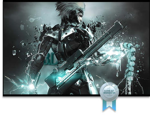
Originally Posted by Breäkdown
Mine sucks , i wish it was more towards the tutorials outcome, anyways here it is:
You should have tried it with your own render, quote etc rather than trying to duplicate Immortals. lol
-
Well usually that's what i do. I do it well try to do it same as the tutorial. Than later on when the urge to make a signature comes i make it with the same tutorial process different renders etc. Try challenging myself to do it without looking at the tutorial second time ..works ..10% of the time though.
-
Originally Posted by Breäkdown
Mine sucks , i wish it was more towards the tutorials outcome, anyways here it is:
nice work man..the text could use a bit of work
but the sig is nicely done.
its ok if u use the same render bro...
as long as u incorporate ur own style into it.
-
Hi im new on this site 
iv been doing sigs before but i had a break for about a half year
so i need to get my skills back :P
here's my out come
looks best if you lower the contrast on your screen

-
-
Similar Threads
-
By Immortal. in forum Sigs & Manips
Replies: 16
Last Post: 11-15-2008, 08:55 AM
-
By flatty in forum Sigs & Manips
Replies: 4
Last Post: 10-23-2008, 03:00 PM
-
By Immortal. in forum Signature Tutorials
Replies: 21
Last Post: 10-11-2008, 11:20 PM
-
By Blitz in forum Sigs & Manips
Replies: 4
Last Post: 04-04-2007, 12:49 PM
-
By Aesahaettr in forum Digital Art
Replies: 4
Last Post: 03-20-2007, 11:58 AM
 Posting Permissions
- You may not post new threads
- You may not post replies
- You may not post attachments
- You may not edit your posts
-
Forum Rules
|


 Reply With Quote