GFXVoid Graphic Design Forum

Remove Text Formatting
Loading...

» Online Users: 5,701

0 members and 5,701 guests
No Members online

» Site Navigation

 > FAQ

» Stats

Members: 35,443
Threads: 103,072
Posts: 826,684
Top Poster: cc.RadillacVIII (7,429)
Welcome to our newest member, Lekelindids
Results 1 to 5 of 5
  1. #1

    Default what can i do to make these better?

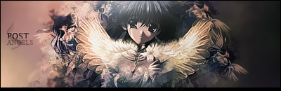
    ok heres my favourite 4 sigs ive made so far what do u guys think i could do to make them better?

    yeah i just made the gears one so meh thats had least work in it so far

    also could u maybe give me a few ideas on the caption things people add in as well as a name plz (a bit like the crispy toast thing lol) cuz im like really bad at thinking of them lol


  2. #2
    Join Date
    Jun 2008
    Location
    DK
    Posts
    35

    Default

    Turn down the contrast. Try with some B/W gradient maps or something..
    My best IMO


    Thx to flatty for depth tips

    My newest


    Collab Flatty and me

  3. #3

    Default

    they seem kinda too bright, and monotone. try not to use too many gradients map and lower the opacity on some of them.
    .:Latest:.
    Gifts:
    - [Groo] [-] [-] [-] -


  4. #4
    Join Date
    Jan 2007
    Location
    Minnesota
    Posts
    5,091

    Default

    Your sigs text in the second one is actually pretty good! It's in there it's blended and it goes well with the sig.
    You should read my text tips tut. It will help you on the basics of text.

    I think a lot of these sigs have too high fo contrast are you using levels to get it that high? Lower the opacity or just next time don't make it as extreme.

    The fourth sig is the best IMO. The smudging BG fits best and tends to look less sloppy than brushing.
    I think you should work on smudgign for your next few sigs.

    The first place to start with these is to check out some tutorials and PSds they are gonna help you more than any crits we will give you. Definetly go check out some tuts and pick up techniques on BG and text and coloring then move on from there.


    My DevART
    RATCHET is my bitch
    Andrew says:
    u ever stolen a bible?
    Apathy says:
    no
    used the last two pages to roll a joint though
    Andrew says:
    wow
    thats fucking hard core
    ^^HAHAHA, dm sucks XD


  5. #5

    Default

    yeah thx
    but about the high contrast lol thats my unique style ive been told
    meh lol i just like bright stuff xD

    and yeah that butterfly one was the only one i used the tutorial for =]

Similar Threads

  1. OMG DID I MAKE THIS?
    By cloud260 in forum Digital Art
    Replies: 4
    Last Post: 10-23-2005, 12:07 PM
  2. LoZ should i make a sig tut?
    By ROTD in forum The Void
    Replies: 10
    Last Post: 08-18-2005, 08:36 PM

Posting Permissions

  • You may not post new threads
  • You may not post replies
  • You may not post attachments
  • You may not edit your posts
  •  
Powered by vBadvanced CMPS v4.1.1