0 members and 7,805 guests
No Members online

» Site Navigation

» Stats
Members: 35,443
Threads: 103,072
Posts: 826,684
Top Poster: cc.RadillacVIII (7,429)
|
-
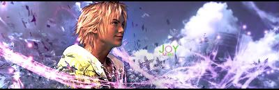
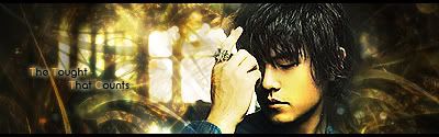
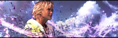
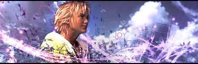
 Two new... I like one! :o Two new... I like one! :o
First one (the one I like):
Second one (meh, not so much):
C&C Please 

Et Tu?
SilentShadow | Jorrne | Arcmenis | Garis | Splinter | Sanbu | DeadlesS | Tekken | Proflax | Suddu
-
-
The first one: it's a bit busy but it's not bad. I like the coloring and the blending is fantastic. BUt why the green inside the text? it doesn't make sense at all. Switch the green to blue and it'd be 100 times better.
i agree with you on the second There's not flow,a nd the text is killing it. It just doesn't rly wow me.
 My DevART
RATCHET is my bitch
Andrew says:
u ever stolen a bible?
Apathy says:
no
used the last two pages to roll a joint though
Andrew says:
wow
thats fucking hard core
^^HAHAHA, dm sucks XD
-
The green text on the first one doesn't really do anything. As Papa said, a blue would be nice. Maybe try smudging his left shoulder to add to the flow.

"Judge a man by his questions,
not his answers."
-Voltaire
-
I smudged his left shoulder a little, not so much that its a visible smudge but so it helps with blending/flow and changed the text color, I couldn't really find a good blue from the sig but this is what I got:
thanks for the C&C keep it coming please
Et Tu?
SilentShadow | Jorrne | Arcmenis | Garis | Splinter | Sanbu | DeadlesS | Tekken | Proflax | Suddu
-
-
Very nice, maybe a more visible light source, try a 200px soft 20% opacity on a very light pink, then over that the same brush but with white. That would add more definition. 
"Judge a man by his questions,
not his answers."
-Voltaire
-
-
ahah Ptka, you read my mind! I was thinking that the every time i looked at it and then now read your comment :3 also added in a little more visible lighting though not too much, didn't want to make it too bright
Updated::
edit(woops wrong copy)
thankies :3
Et Tu?
SilentShadow | Jorrne | Arcmenis | Garis | Splinter | Sanbu | DeadlesS | Tekken | Proflax | Suddu
-
-
the first one...the v3 looks quite nice.
i really like the text you did and it overall looks quite nice.
well done.
 Posting Permissions
- You may not post new threads
- You may not post replies
- You may not post attachments
- You may not edit your posts
-
Forum Rules
|


 Reply With Quote


